




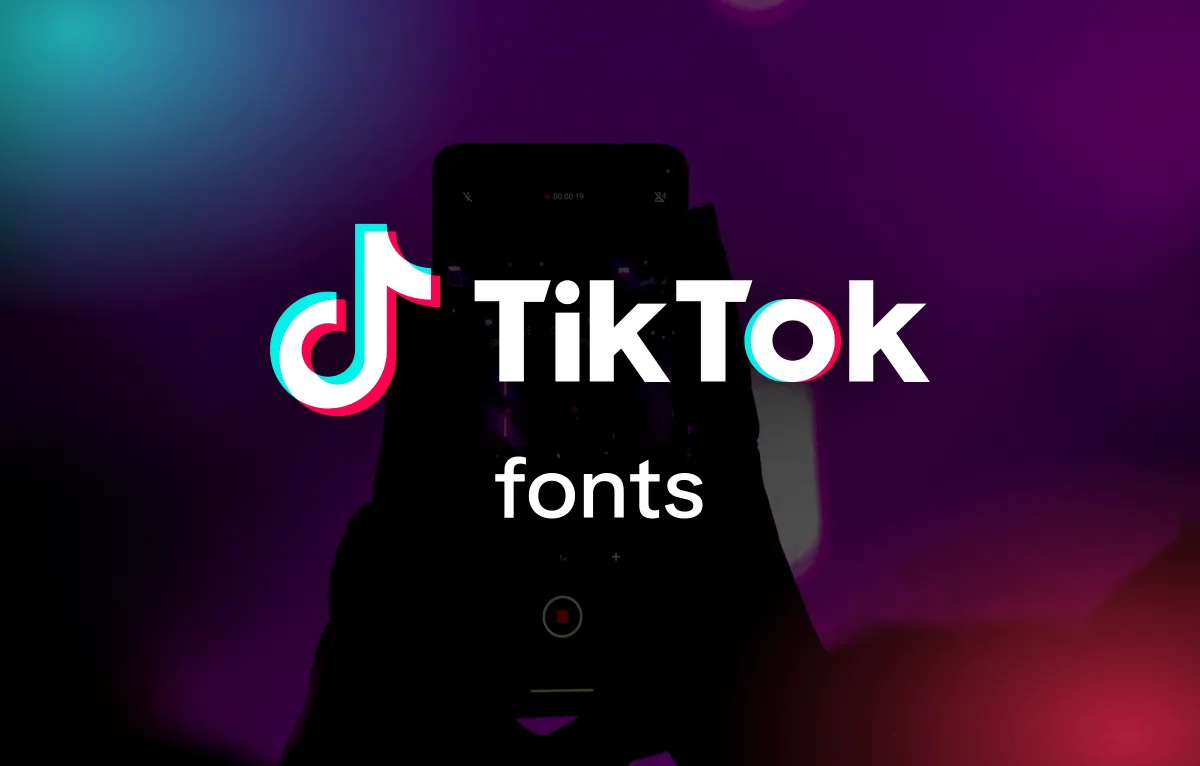
TikTok uses a typeface called TikTok Sans. It was drawn for them by the Swiss foundry Grilli Type, it arrived in May 2023, and it's now in the app, the auto captions, the adverts and the default text style you type over your videos. Before that the app ran on Proxima Nova, which is why half the answers you'll find online still say so. The logo is a separate thing again: custom lettering from 2018 sitting next to a musical note that started life as a letter d.
And here's the bit that makes TikTok different from every other platform i've written about. In 2025 TikTok gave TikTok Sans away. It's on Google Fonts under an open licence, so unlike the Instagram or Facebook fonts you can download the real thing and use it in your own work today. Below I go through each layer, where the fonts came from, what the text tool styles really are, and the free fonts I'd use for the rest.
TikTok Sans is shown for real, loaded from Google Fonts. The wordmark isn't a font, and TikTok hasn't named the other text tool styles, so those rows use free fonts that give a similar feel.
What font does TikTok use, layer by layer
The confusing part is that TikTok changed its font in 2023 and most of the "TikTok font" articles were written before that. The note icon, the word TikTok next to it, the interface, the captions and the text you add to a video are all separate jobs, and three of them have changed hands. Here's the full picture.
| Where you see it | Font | Notes |
|---|---|---|
| Logo symbol | Custom drawing, 2016 | A letter d for Douyin that doubles as a musical note, drawn in-house at ByteDance |
| Logo wordmark | Custom lettering, 2018 | Not a font. Often called Sofia Pro, but the letters don't match |
| App interface since May 2023 | TikTok Sans | Custom typeface by Grilli Type, now open source |
| App interface before 2023 | Proxima Nova | Mark Simonson's geometric sans, the default app font of the 2010s |
| Auto captions | TikTok Sans | Generated captions and subtitles |
| Text tool, Classic | TikTok Sans | Was Proxima Nova Semibold before 2023 |
| Text tool, other styles | Typewriter, Handwriting, Neon, Serif | Separate fonts TikTok hasn't named |
| Marketing, 2018 era | Sofia Pro | Used on the 2018 website and in Wolff Olins' brand work |
The logo started as a letter d
Most people assume the TikTok symbol is a musical note and nothing more. It is a note, but it started as a letter. ByteDance launched the Chinese version of the app in September 2016 and soon renamed it Douyin, which roughly means "trembling sound". The mark was drawn in-house by a designer the company has never named, and the shape is a lowercase d for Douyin that happens to read as a quaver too. The cyan and red-pink offsets either side of it are meant to show that trembling, like a note held with vibrato. It's a neat bit of thinking for a logo that most people now read as "the TikTok thing".
TikTok launched outside China in September 2017 with the same symbol. The wordmark, the word TikTok written out in heavy sans letters, came in 2018, the year ByteDance folded the lip-sync app musical.ly into TikTok. Both parts have stayed the same since, which in social media terms is a very long time.
The wordmark isn't Sofia Pro, whatever the font sites say
Search for "TikTok logo font" and you'll be told it's a modified Sofia Pro, Olivier Gourvat's rounded geometric sans. I can see why. TikTok's early marketing did use Sofia Pro, including the 2018 website and the brand work by the agency Wolff Olins, so the two sat next to each other a lot. But put the wordmark over Sofia Pro letter for letter and nothing lines up. The k has a different joint, the o is a different shape, the weight is heavier than Sofia goes. It's custom lettering, drawn once for one word, and there's no font file behind it.
That matters if you're hoping to type it. You can't, and TikTok's brand guidelines are clear that you shouldn't recreate the logo or set your own name in a lookalike. What you CAN do is borrow the feel, and I list the free fonts I'd use for that further down.
The symbol is a letter pretending to be a note. The wordmark is lettering pretending to be a font. Neither is something you can download.
TikTok Sans is the font doing the real work
For its first six years the app itself was set in Proxima Nova, Mark Simonson's sans that became the default face of start-ups in the 2010s. It's a lovely typeface, but it was never designed for a platform with a billion users typing in dozens of languages at thumb size, and TikTok decided it needed its own.
TikTok Sans was announced on 17 May 2023. TikTok's design director Alex Polozun worked on it with Grilli Type, the Swiss foundry behind GT America and GT Walsheim, and the project took about a year. The brief was legibility first. Compared with Proxima Nova the letters have bigger openings and clearer strokes so they're easier to tell apart, the shapes are simpler, the whole thing sits visually larger on the line, and TikTok added a bit more line height and its own spacing formula on top. It comes in Text and Display sizes, and it builds on the wordmark, so the heavy end of the family has that same chunky, slightly squared feel.
Two details I like as a type designer. There are stylistic alternates for the letters and numbers that get confused with each other, like a capital I and a lowercase l, and TikTok uses them to make username spoofing harder. And the figures come with equal-width versions so prices and LIVE reaction counts line up as they tick over. Those are the kind of features nobody notices until they're missing.
It launched in English, Spanish, Portuguese, French, German, Italian, Indonesian, Turkish and Vietnamese, with more promised. And, as with every font change on a big platform, people hated it for about a week. Users complained that the app suddenly looked different and a bit off. It always does. Then everyone forgot, which is exactly what happened when Instagram changed its wordmark this summer.
Yes, you can download TikTok Sans
This is the part that surprised me. In 2025 TikTok released TikTok Sans as an open-source font under the SIL Open Font License. That's the same licence most of Google Fonts uses, and it means you can use the font in personal and commercial work, embed it, and even modify it, for free. It's on Google Fonts and on GitHub, and the GitHub version is the one to grab if you want the full variable font.
The open-source version is bigger than the one that shipped in 2023. Type Network, together with Contrast Foundry and the font engineer Aaron Bell, spent about nine months expanding it. Contrast Foundry's Maria Doreuli and Krista Radoeva drew the condensed and expanded ends of the family, the Greek and Cyrillic were refined to sit with the Latin, and the result is a single variable font with four axes: weight from 300 to 900, width from 75 to 150, optical size from 12 to 36 and a slant up to six degrees. That's an unusually generous font to get for nothing. If you've never used a variable font before, the width axis alone is worth a play, because it lets one file do the job of a condensed, a regular and a wide family. I use the same idea in my own Noire, which runs from thin to black in one file.
Two cautions. It covers Latin, Greek and Cyrillic, so if you need Arabic, Thai, Chinese, Japanese or Korean you'll need something else; TikTok says as much in its own notes. And an open licence on the font doesn't loosen the brand rules. You can set your own poster in TikTok Sans all day long, but you still can't make something that looks like it came from TikTok.
What font TikTok uses for captions and comments
Here TikTok does something Instagram and Facebook don't. Those apps show captions and comments in your phone's own system font, San Francisco on an iPhone and Roboto on Android, which is why I spend a whole section on it in what font Facebook uses. TikTok draws its interface in TikTok Sans on every phone, so a caption, a comment, a username and the For You tabs all look the same whoever is holding the device. Auto-generated captions and subtitles are TikTok Sans too.
The trade-off is that TikTok Sans has to carry the whole app in dozens of languages, which is a big reason it was built the way it was, with the open shapes and the anti-spoofing alternates. YouTube takes a middle path with Roboto plus its own YouTube Sans, as I explain in what font YouTube uses.
The text tool styles, and what they actually are
When you add text to a video, TikTok gives you a short list of styles rather than a font menu. The ones everyone knows are Classic, Typewriter, Handwriting, Neon and Serif, and the list has grown and shuffled over the years. Classic is the one people mean when they say "the TikTok font", and it's now TikTok Sans. If you watch a video from 2021 the Classic text is Proxima Nova Semibold, because that's what the app used then, and that's the source of most of the confusion online. TikTok has never said what the Typewriter, Handwriting, Neon and Serif styles are, and they look like licensed or custom faces rather than anything you can name from Google Fonts.
My advice is the same as for Stories on Instagram. Pick one style and stick with it across your videos so your account looks like one person made it. Classic is the safest because it was designed to be read at phone size over moving video, and the Neon and Handwriting styles get hard to read fast once there's anything busy behind them. If you spot a font in someone else's video and want to know what it is, my guide to finding a font from an image covers the free tools that can match it from a screenshot.
Free TikTok font alternatives I'd actually use
For the app font you don't need an alternative, because the real TikTok Sans is free. For the wordmark and the text tool styles, these are the free fonts on Google Fonts that get closest. They all come with an open licence, but check it anyway before you use any font commercially, especially if you've found it somewhere other than Google Fonts.
| Font | Closest to | Why I'd use it |
|---|---|---|
| TikTok Sans | TikTok Sans | It's the real thing, free since 2025, with weight, width, slant and optical size axes |
| Montserrat ExtraBold | The wordmark | The closest free match for that heavy geometric feel, and it holds up tiny |
| Poppins Bold | The wordmark | Rounder and friendlier, good if Montserrat feels too corporate |
| Figtree | Proxima Nova | Warm geometric sans that gives you the pre-2023 TikTok feel without the licence fee |
| Courier Prime | Typewriter style | A typewriter face that was actually designed to be read, unlike most of them |
| Caveat | Handwriting style | Casual handwriting that stays legible over a video |
| Tilt Neon | Neon style | A glowing variable font that bends as you resize it, fun in small doses |
If I were building a brand that lives on TikTok, I'd set headlines in TikTok Sans Black with the width pushed up, body in TikTok Sans Regular, and leave it at that. One family, one file, and it's already what your audience reads all day. If you want something with more personality than a platform font, that's what I make Noire for, and there are more free options in my list of the best Google Fonts for logo design.
Those TikTok font generators for your bio
If you came here looking for fancy fonts for your TikTok bio or username, the generator sites don't change TikTok's font at all. They swap your letters for lookalike Unicode symbols, like 𝓽𝓱𝓲𝓼 or 𝕥𝕙𝕚𝕤, which show up the same on every phone. They work for a word in your bio, but screen readers mangle them, search won't find a name written in symbols, and TikTok Sans's anti-spoofing alternates exist precisely because people use these tricks to impersonate accounts. I'd keep them for a word or two at most.
Quick answers about TikTok fonts
What font does TikTok use?
TikTok uses its own typeface, TikTok Sans, across the app, auto captions and brand material. It was made with the Swiss foundry Grilli Type and replaced Proxima Nova in May 2023. The logo is separate custom lettering, not a font, and the text tool adds a few more styles such as Typewriter, Handwriting, Neon and Serif.
What font is the TikTok logo?
The TikTok wordmark is custom lettering drawn in 2018, so there's no font file for it. It's often said to be a modified Sofia Pro, but the letters don't match. The musical note symbol came first, drawn in-house in 2016 as a letter d for Douyin, the Chinese version of the app.
Can I download TikTok Sans?
Yes. In 2025 TikTok released TikTok Sans as an open-source font under the SIL Open Font License, so it's free for personal and commercial use. It's on Google Fonts and GitHub as a variable font with weight, width, optical size and slant axes.
What font does TikTok use for captions?
Auto-generated captions are set in TikTok Sans. Text you add yourself uses whichever text tool style you pick. The default Classic style is TikTok Sans too, while Typewriter, Handwriting, Neon and Serif are separate fonts that TikTok hasn't named.
What font did TikTok use before TikTok Sans?
Proxima Nova, a geometric sans by Mark Simonson, was TikTok's interface font until May 2023. That's why older guides, and the Classic text style in old videos, point to Proxima Nova. Marketing in the 2018 era also used Sofia Pro.
What free font looks like the TikTok logo?
Montserrat ExtraBold is the closest free match for the heavy geometric feel of the wordmark, with Poppins Bold as a rounder option. Neither is a copy, and TikTok's brand rules don't allow you to recreate or restyle its logo anyway.
Test your type at phone size before you post
Whatever you pick, remember that TikTok is watched on a phone, vertically, with a thumb hovering over the skip. Text has about a second to land. So before you post, watch your video back on your phone, not your monitor, and if you can't read the text in that second it's too thin, too long or too fancy. TikTok Sans was built for exactly that job, which is the best argument for using it. And if you want text that looks like it's bleeding into the frame rather than floating on top of it, our BLEEDR ink bleed generator will do that with any font, TikTok Sans included.