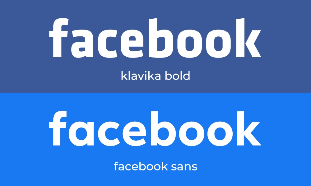
Facebook doesn't use one font — it uses three, depending on where you look. The logo and brand wordmark are set in Facebook Sans, a custom typeface designed by foundry Dalton Maag. Everything in your feed — posts, comments, profile names — is set in your own device's system font: San Francisco on iPhone, Roboto on Android and Segoe UI on Windows. And across the wider Meta brand, a separate family called Optimistic does the heavy lifting. The original 2005 logo used a modified version of Klavika Bold.
I've spent 15 years designing and choosing type for brands, and Facebook is one of the smartest examples of a company using different fonts for different jobs rather than forcing one typeface to do everything. Below I'll break down each one — the logo, the feed, Messenger and Meta — explain why Facebook made those choices, and share the free alternatives I'd reach for if you want that clean, friendly, geometric look in your own designs.
Samples shown in close geometric stand-ins; Facebook Sans itself is proprietary and not publicly available.
What Font Does Facebook Use? The Quick Answer
The reason "what font does Facebook use" has so many slightly different answers online is that the honest answer is "it depends which Facebook you mean." The blue f logo, a headline in an advert, and the text of a friend's comment are three separate typographic systems. Here's the whole picture in one table:
| Where you see it | Font | Notes |
|---|---|---|
| Logo & wordmark | Facebook Sans | Custom typeface by Dalton Maag; replaced the Klavika-based logo |
| Original logo (2005–2019) | Klavika Bold (modified) | By Eric Olson; tweaked by agency Cuban Council |
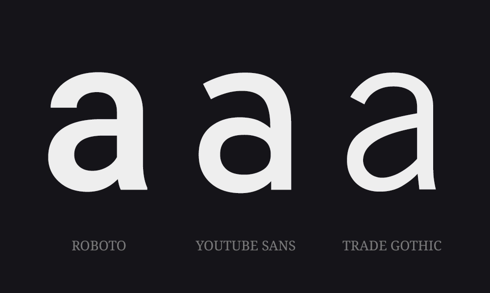
| Posts, comments, names | Your device's system font | San Francisco (iOS), Roboto (Android), Segoe UI (Windows) |
| Wider Meta brand | Optimistic | Display + Text family, also by Dalton Maag (2021 rebrand) |
| Messenger | System font | Same as the main app; Helvetica Neue on some desktop builds |
If you've ever wondered why this question is trickier than it looks, it usually comes down to the difference between a typeface and a font — our quick explainer on font vs typeface clears that up in a minute, and it makes the rest of this article much easier to follow.
What Font Is the Facebook Logo?
Today's lowercase facebook wordmark — and the rounded f in the app icon — is set in Facebook Sans, a bespoke typeface commissioned by the company and drawn by the respected London foundry Dalton Maag (the same studio behind custom fonts for Nokia, BMW and Ubuntu). It's a geometric sans-serif with soft, humanist touches: open letterforms, gently rounded terminals and a single-story a, all tuned to stay crisp at tiny icon sizes as well as on a billboard.
It wasn't always this way. From 2005, the original Facebook wordmark used a customised version of Klavika Bold, a geometric, slightly technical sans-serif designed by Eric Olson at Process Type Foundry. The agency Cuban Council made small modifications — adjusting spacing and a few letterforms — so the mark felt unique to Facebook. Klavika gave the young brand a clean, modern, faintly engineered feel that suited a tech company perfectly. The shift from a modified off-the-shelf face to a fully custom one mirrors what most maturing brands do as they grow.
One detail people often ask about: the spacing. The letters in the wordmark sit closer together than a default font setting, which helps the word read as a single confident unit. If you're curious how much spacing changes the feel of a logo, our guide to tracking in typography shows exactly that effect.
Facebook didn't pick one perfect font — it picked the right font for each job, then got out of the way and let your phone do the rest.
Facebook Sans — The Custom Brand Typeface
Facebook Sans is the typeface you'll find anywhere the brand is speaking as itself: the logo, app icon, headline moments, event branding and marketing. Its job is personality and recognition. Compared to the old Klavika-based mark it's friendlier and rounder — more open, a little warmer — which fits a platform built around people rather than products. Because it's a full family (multiple weights and styles), designers inside Meta can keep everything from a tiny notification badge to a huge campaign headline visually consistent.
The short, important caveat: Facebook Sans is proprietary. It's owned by Meta and isn't sold or shared — you won't find it on Google Fonts, Adobe Fonts or any legitimate library. That's completely normal for a major brand face (the same is true of the Nike logo font), and it's the reason the "free alternatives" section below exists.
What Font Does Facebook Use for Posts & Comments?
This is the part that surprises people: Facebook doesn't use its own font for the feed at all. Posts, comments, captions and profile names are rendered in whatever system font your device already uses. On an iPhone or iPad that's San Francisco; on Android it's Roboto; on Windows it's Segoe UI. On the web, the stylesheet falls back through a "system-ui" stack so the page borrows the operating system's default face:
system-ui, -apple-system, BlinkMacSystemFont, "Segoe UI", Roboto, Helvetica, Arial, sans-serif
There are two big reasons for this. First, speed: the font is already installed on your device, so there's nothing extra to download and text appears instantly. Second, familiarity and accessibility: system fonts are tuned by Apple, Google and Microsoft for screen readers, scaling and contrast, so a comment reads comfortably and feels native to whatever device you're holding. The same logic explains why you can't "match the Facebook post font" exactly — it changes depending on who's reading. (It's the identical strategy behind the font YouTube uses for its interface.)
What Font Does Facebook Messenger Use?
Messenger follows the main app's playbook: the interface uses your device's system font, so your chats appear in San Francisco, Roboto or Segoe UI just like the feed. On some desktop builds Messenger has historically leaned on Helvetica Neue, a classic, highly legible sans-serif — but for the vast majority of users on phones, it's simply the native system face. In short: there's no separate "Messenger font" to track down.
What Font Does Meta Use?
When Facebook's parent company rebranded as Meta in 2021, it needed a typeface that could speak for the whole house — Facebook, Instagram, WhatsApp, Quest and more — without belonging to any single app. The answer was a custom family called Optimistic, again by Dalton Maag, split into Optimistic Display for headlines and Optimistic Text for body copy. It's clean, modern and deliberately neutral, designed to feel cohesive across very different products and screens. Importantly, Meta-level branding and individual app branding are separate layers: Facebook keeps its own logo font, while Optimistic ties the broader corporate identity together. Like Facebook Sans, the Optimistic family is proprietary and not publicly available.
Can You Download the Facebook Font?
No — and it's worth being clear about why. Both Facebook Sans and the Optimistic family are custom, trademark-protected typefaces owned by Meta. They aren't sold on any marketplace or licensed to the public, so there's no legitimate way to download "the Facebook font" itself. Any file you find online with that name is an unofficial recreation — fine for personal mock-ups and learning, but never appropriate for client work or anything that could imply you're Facebook.
The good news: you don't need the exact file to capture the feel. Facebook's brand look comes from a clean, geometric, friendly sans-serif — and there are excellent fonts, including free ones, that get you most of the way there.
Free & Paid Facebook Font Alternatives
If you want that approachable, geometric, social-media character without crossing any legal lines, these are the typefaces I'd reach for. Several are free on Google Fonts and pair well with a simple logo mark.
| Font | Cost | Why it works |
|---|---|---|
| Jost | Free (Google Fonts) | Open-source geometric sans; the closest free starting point for the brand feel |
| Poppins | Free (Google Fonts) | Rounded, geometric and friendly — great for headlines and logos |
| Inter | Free (Google Fonts) | A modern UI face that mimics the system-font feed look extremely well |
| Barlow | Free (Google Fonts) | Slightly rounded, low-contrast sans that scales cleanly across sizes |
| Klavika | Paid (Process Type Foundry) | The legitimate route to the original Facebook wordmark feel |
For more open-source picks you can use commercially without a licence fee, see our guides to the best Google Fonts for logo design and the best free fonts.
A Quick Note on "Facebook Font Generators"
If you searched for a Facebook font generator or "stylish fonts for your bio," you're after something slightly different: those tools don't change Facebook's actual font — they swap your letters for lookalike Unicode characters (𝓯𝓪𝓷𝓬𝔂 𝕝𝕖𝕥𝕥𝕖𝕣𝕤) that display the same everywhere. They're handy for a profile name or post, but they aren't real typefaces and can cause problems for screen readers. If you want genuinely characterful type for your own designs instead, our collection of free fun fonts is a better place to start.
How To Identify a Font You Spot on Facebook
Seen a typeface in an advert or a friend's graphic and want to know what it is? You don't have to guess. Our walkthrough on finding a font from an image covers the free tools that match type from a screenshot — useful any time the answer isn't "Facebook Sans."
Frequently Asked Questions
What font does Facebook use?
Facebook uses more than one font. The logo and brand wordmark use Facebook Sans, a custom typeface designed by Dalton Maag. Everything in the feed — posts, comments and profile names — uses your own device's system font: San Francisco on iPhone, Roboto on Android and Segoe UI on Windows. The original 2005 logo used a modified version of Klavika Bold.
What font is the Facebook logo?
The current Facebook logo uses Facebook Sans, a custom lowercase sans-serif created by Dalton Maag. The original wordmark, used from 2005, was a customised version of Klavika Bold by Eric Olson, tweaked by the agency Cuban Council. Both are proprietary and not available to the public.
What font does Facebook use for posts and comments?
Facebook doesn't use one fixed font for posts and comments. It uses your device's native system font so text loads instantly and matches the rest of your phone or computer: San Francisco on iOS, Roboto on Android and Segoe UI on Windows. On the web it falls back through a system-ui font stack.
Can I download the Facebook font?
No. Facebook Sans is a proprietary typeface owned by Meta and isn't sold or available on Google Fonts or Adobe Fonts. Any file labelled "Facebook font" online is an unofficial recreation. For a similar look, use a free geometric sans-serif such as Jost or Poppins from Google Fonts.
What font does Meta use?
Since the 2021 rebrand, the wider Meta brand uses a custom typeface family called Optimistic — Optimistic Display for headlines and Optimistic Text for body copy — also by Dalton Maag. Individual apps such as Facebook keep their own logo fonts and continue to use device system fonts inside the product.
What font does Facebook Messenger use?
Messenger follows the main Facebook app and uses your device's system font for the interface — San Francisco on iOS, Roboto on Android and Segoe UI on Windows. On some desktop builds it has historically used Helvetica Neue.
Conclusion
The smartest thing about Facebook's typography is that it refuses to over-design. A custom Facebook Sans carries the brand, the wider Optimistic family ties Meta together, and the feed quietly hands the job to your own device's font so text is fast, familiar and accessible. You can't license Facebook Sans, but you can absolutely borrow the principle: a clean geometric sans for your brand voice, and a reliable system or web font for everything people actually read. If you'd like to experiment with that friendly, confident energy in your own work, browse our signature typefaces, and our guide on how to install a font will get you set up in minutes.