



The best fonts for posters are the ones people can read before they've decided whether to stop walking. That's the whole job. A poster gets a few seconds from someone passing, often from across a street or the far end of a corridor, so the font has to work fast and from a long way off.
I've been designing type and graphics for fifteen years, and posters are where you find out quickly if a font is any good. Below are the free and paid fonts I'd use, split by the kind of poster you're making, plus the sizing rules that matter more than the font itself.
What makes a poster font work
Distance changes everything. A font that looks lovely on your screen at 100% can turn to grey mush three metres away, because the fine details are the first thing to go. So the fonts that work best on posters have simple shapes, big open counters (the holes in letters like a, e and o) and enough weight to hold up.
Condensed fonts are popular for a reason. They let you set a few words really big across the width of the poster, and big beats clever almost every time.
Contrast matters too, in size and weight as well as colour. A heavy headline next to small, light details gives the eye somewhere to start. If everything on the poster is the same size and weight, nothing gets read at all, people just see a grey block and keep going. That's the most common problem I see on posters, and it has nothing to do with which font you picked.
Here's a quick test i use. Shrink the whole poster down to the size of a stamp on screen. If you can still read the headline, it'll work on a wall.
The best free fonts for posters
All six of these are on Google Fonts under the Open Font Licence, so you can use them on commercial work. Plenty of fonts on other free sites are for personal use only, so check the licence before anything goes to print. And if you'd rather have something that isn't on every other poster in town, I drew Defiant for exactly this, posters and big advertising.
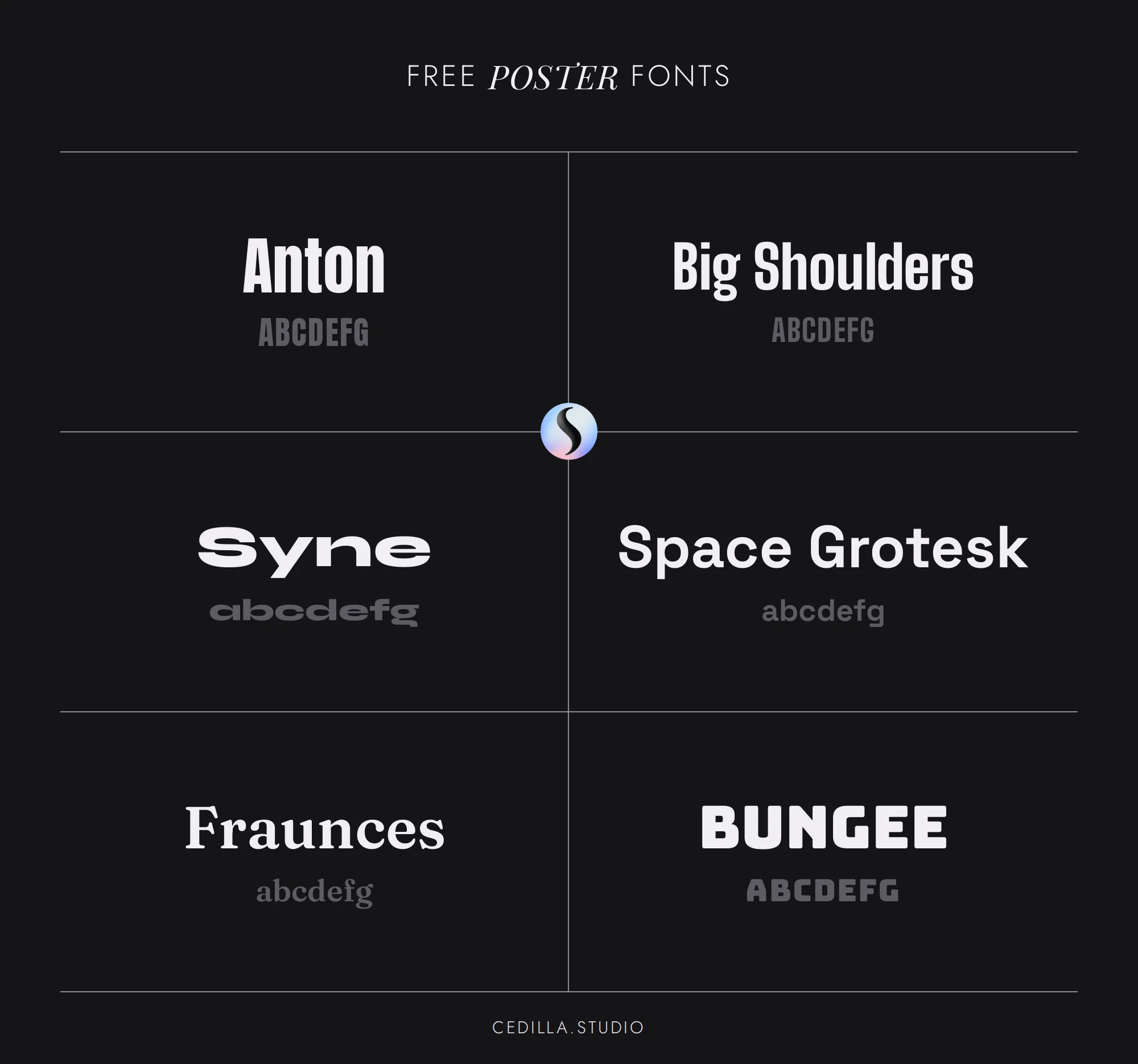
fig.1: The six free poster fonts below, from Anton to Bungee.
Anton is my first pick for a free poster headline. Vernon Adams based it on the tall, heavy sans serifs that advertising leaned on for decades, and it fills a narrow space with very big letters. It doesn't fall apart when you tighten the spacing either, which a lot of free fonts do.
Big Shoulders was made by Patric King for the City of Chicago's design system, and you can feel the railway signs and protest placards in it. It's condensed like Anton but lighter on its feet. It now has an optical size setting too, so the same font tightens up for a headline and opens out for the small print.
Syne started life in 2017 as the typeface for Synesthésie, an art centre just outside Paris. The odd thing about it is that the heavier weights get much wider, so the ExtraBold looks almost stretched sideways. That's why it works so well on exhibition and event posters, it doesn't look like anything else.
Space Grotesk is Florian Karsten's proportional version of Space Mono. It has the plain feel of a Swiss poster with a few quirky details that stop it being boring.
Fraunces is a soft serif from Undercase Type, inspired by early 1900s faces like Windsor, Souvenir and Cooper. It's a variable font with a softness setting, so you can push it rounder and more 70s or sharper and more serious. Set it big and italic for anything retro.
Bungee by David Jonathan Ross was built for signs, including vertical ones where the letters stack on top of each other. It also comes with layer fonts for building two-colour lettering. It's loud, so save it for posters that are meant to be.
Gig and club posters can be louder
Music posters get more freedom than anything else. People expect them to look a bit wild, and a font with some character tells them the genre before they've even read the band name.
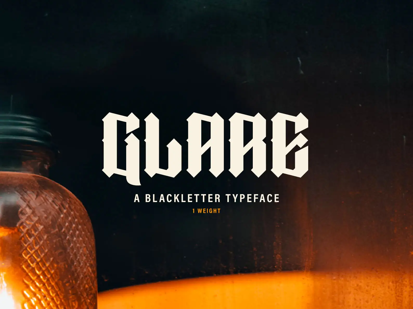
Condensed sans serifs like Anton and Big Shoulders cover most indie and rock posters. Bungee suits anything playful. For metal, punk and darker club nights blackletter is the obvious choice, and it's obvious because it works. I drew Glare for that kind of job, a blackletter built on a grid so it stays readable from a distance. If you want the background, my blackletter typography guide covers where the style came from.
Just don't set the details in the same font. The date, venue and ticket link are read by someone who's already interested, so give them a plain sans and let the headline do the shouting.
Why so many film posters use Trajan
Walk past a cinema and you'll see Trajan everywhere. Carol Twombly drew it for Adobe in 1989, based on the Roman capitals carved into Trajan's Column. It's all caps and very formal, and it became shorthand for "serious film" so quickly that designers now treat it as a bit of a cliché.
If you want that epic feel without the cliché, try a different serif in caps with loads of space between the letters. Cinzel is a free one in the same Roman spirit, and generous spacing does most of the work. Action and horror posters tend to go the other way, with heavy condensed sans serifs set huge. Anton or Bebas Neue will get you most of the way there.
The Swiss poster look is still a safe bet
For exhibitions, talks and design events, a clean grotesque on a strong grid is hard to beat. The look comes from the Swiss posters of the 1950s and 60s. Josef Müller-Brockmann's favourite typeface was Akzidenz-Grotesk, and he used it big, flush left and surrounded by empty space.
Helvetica, drawn by Max Miedinger in 1957, is still the font people mean when they say "clean". But you don't need to buy it to get the look. Space Grotesk or Inter set large and tight, with one strong colour and plenty of space, does the same job for free.
Academic posters play by different rules
A conference poster isn't trying to stop people in the street. It's trying to get someone standing a metre or two away to read a few hundred words, so readability beats personality every time.
Most university poster guides suggest a title of around 72pt or more, section headings of 36pt to 48pt and body text no smaller than 24pt. Use a sans serif with open shapes for the body, like Source Sans 3 or Inter, both free, and keep any display font for the title only.
And cut the text. It's the biggest single improvement you can make to an academic poster, far bigger than changing the font.
Using these poster fonts in Canva
If you're making your poster in Canva, some of the fonts here are already in there, Anton and Bebas Neue included. I've put together a separate list of the best Canva fonts with the ones that hold up in print.
How big your poster text needs to be
It needs to be bigger than you think. Sign makers use a rough rule of about 1 inch (2.5cm) of letter height for every 10 feet (3m) someone will be standing away. So a headline meant to be read from across a six metre room wants capital letters of around 5cm, and that's the minimum, not the target.
Before you print the real thing, print it at A4 and stick it on a wall at the far end of a room. If you have to walk closer to read the headline, go bigger. It's the cheapest test there is and NOBODY does it.
Big type needs its spacing fixed too. Fonts are spaced for average sizes, so at poster sizes the gaps between letters look huge. Pull the tracking in, then fix the awkward pairs by eye. My post on tracking in typography goes through it, and there are heavier picks than the ones above in my list of bold display fonts.
Two fonts is plenty on a poster
There's an old rule that says never use more than three fonts on one design. For posters i'd go further and say two. One display font for the headline and one plain text font for everything else gives you all the contrast you need, and anything more starts to look like a ransom note.
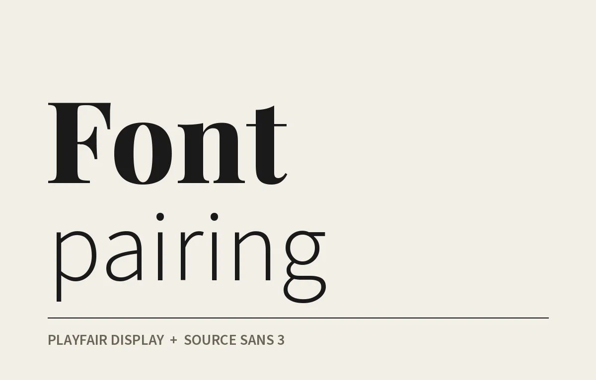
Pick ONE display font and let it lead. If you're not sure what to put with it, my post on font pairing goes through how I choose. Then print it, stick it up across the room and walk past it like a stranger would.