A logo font has a harder job than any other type on a brand. It has to read at the size of a browser tab icon and on the side of a van, survive being embroidered or engraved, and still look like nobody else's. Plenty of fonts that look lovely in a specimen fall apart on one of those.
So this is the full list of logo fonts I'd actually reach for: 13 free Google Fonts you can use in a logo today, three more free finds, eleven paid faces that are worth the money, and three of our own. Each one comes with what it's good for and where to get it.
How to pick a logo font
Test it tiny. Set the brand name at 16px, roughly the size of a browser tab icon or a social avatar. If the letters fill in or blur together, keep looking.
Check the licence first. Everything on Google Fonts is open source (mostly the SIL Open Font License, a few use Apache 2.0), and both allow logos. Fonts from free-font sites are often personal use only, and a logo is commercial use.
Treat the font as a starting point. Popular fonts like Montserrat and Playfair Display are popular for good reason, but thousands of brands already use them. Nearly every good wordmark is a font that's been edited: spacing adjusted by hand, one letter redrawn, two letters joined. That's what turns a common font into your logo.
One font for the logo, maybe a second for everything else. The logo usually uses a single font. The rest of the brand can use a quieter partner for body text, and my font pairing guide covers how to choose one.
All 30 logo fonts at a glance
| Font | Style | Price | Where to get it |
|---|---|---|---|
| Montserrat | Geometric sans | Free | Google Fonts |
| Poppins | Geometric sans | Free | Google Fonts |
| Raleway | Elegant sans | Free | Google Fonts |
| Work Sans | Neutral sans | Free | Google Fonts |
| Oswald | Condensed sans | Free | Google Fonts |
| Roboto | Neutral sans | Free | Google Fonts |
| Syne | Expressive sans | Free | Google Fonts |
| Playfair Display | High-contrast serif | Free | Google Fonts |
| Lora | Calligraphic serif | Free | Google Fonts |
| Libre Baskerville | Classic serif | Free | Google Fonts |
| Merriweather | Sturdy serif | Free | Google Fonts |
| Cinzel | Roman capitals | Free | Google Fonts |
| Forum | Roman serif | Free | Google Fonts |
| Cyrene | Display serif | Free | Behance |
| Garogier | Garamond-style serif | Free | 1001 Fonts |
| Amagro | Wedge serif, caps | Free (check licence) | Font Squirrel |
| Ogg | Calligraphic serif | Paid | Sharp Type |
| Wayfarer | Display, many alternates | Paid | Jeremy Vessey |
| Larken | Soft serif | Paid | Font marketplaces |
| Prestiggio | Fashion display serif | Paid | Font marketplaces |
| Bahn Pro | Signage sans | Paid | Font marketplaces |
| Halis Grotesque | Grotesque sans | Paid | Font marketplaces |
| Occitanie | Vintage display serif | Paid | Font marketplaces |
| Parlour Pro | Barbershop display | Paid | Hustle Supply Co. |
| Boiling | Bold display serif | Paid | Font marketplaces |
| Big Caslon | High-contrast serif | Paid (free on Macs) | Type Network |
| Moche | Reversed-contrast sans | Paid | Pépite |
| CS Glare | Grid blackletter | Paid | Cedilla Studio |
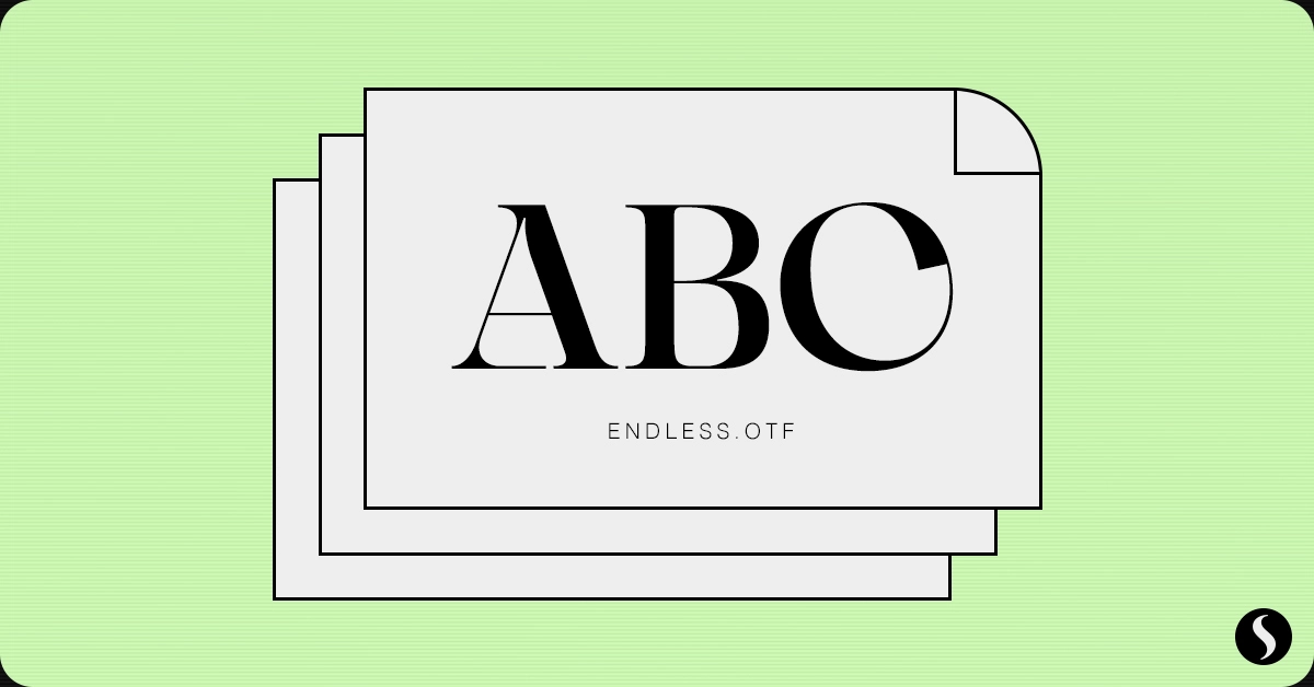
| CS Endless | Experimental serif | Paid | Cedilla Studio |
| CS Noire | Contemporary sans | Paid | Cedilla Studio |
Free Google Fonts for logos
Start here if the budget is zero. Every font in this section is free for commercial use, logos included, and you can download it in a couple of clicks.
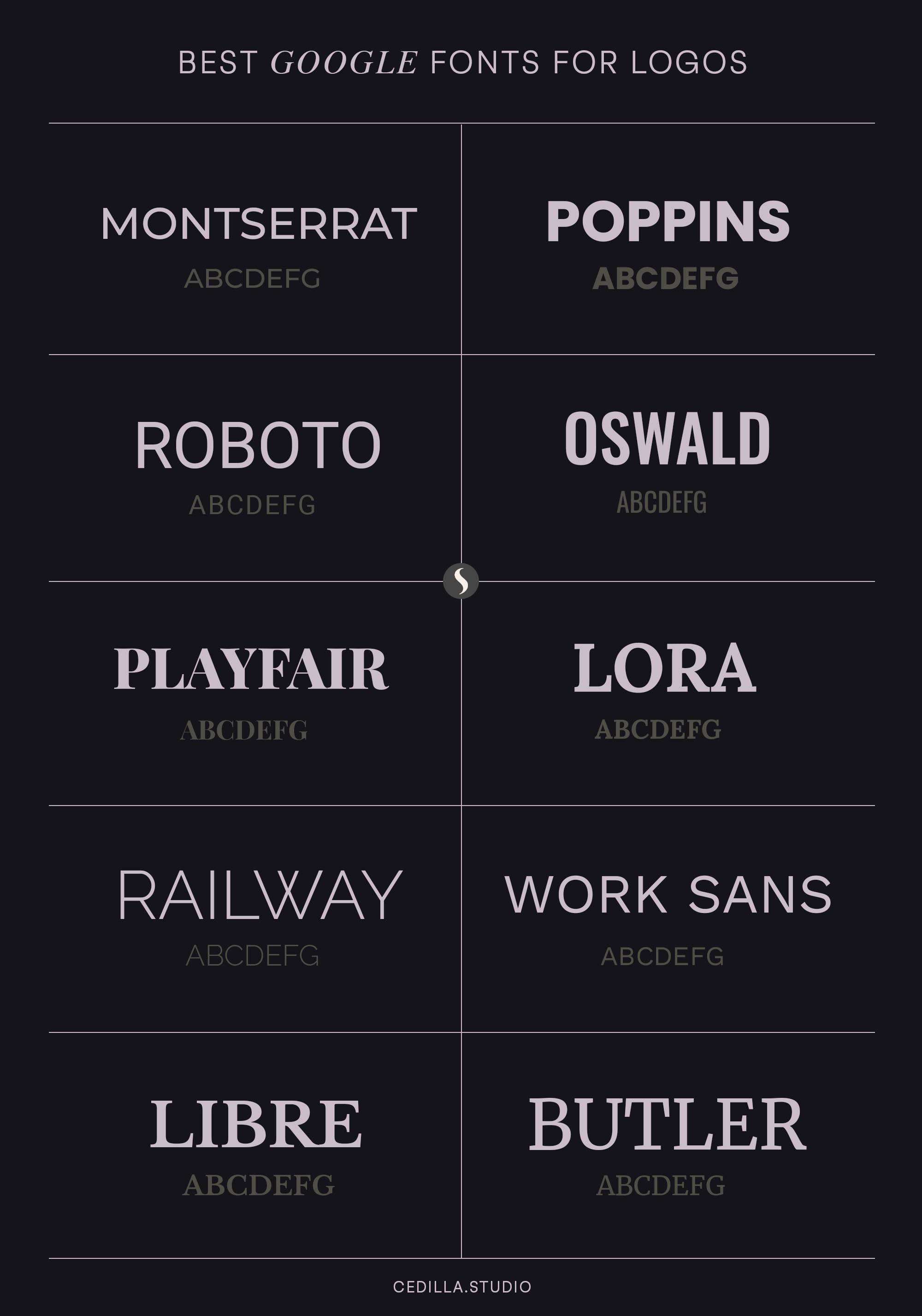
fig.1: Free logo fonts, from clean sans-serifs like Montserrat to classic serifs like Libre Baskerville.
Montserrat
A geometric sans with wide, round letters, inspired by old posters and shop signs in the Montserrat neighbourhood of Buenos Aires. It's clean, modern and holds up well at small sizes, which is why it's one of the most-used fonts on the web. That's also the catch: adjust the spacing or a letter or two so your logo doesn't look like everyone else's.
Get it: Google Fonts
Poppins
A geometric sans built on near-perfect circles, with friendly, rounded shapes. It feels approachable without looking childish, so it suits apps, start-ups and lifestyle brands, and it works for casual and professional logos alike.
Get it: Google Fonts
Raleway
An elegant sans with very thin strokes at its lighter weights. Set in capitals with generous spacing, it gives a logo a sleek, refined look that suits fashion, interiors and minimalist brands.
Get it: Google Fonts
Work Sans
Neutral but modern, and comfortable on screens. It gives tech and corporate brands a clean, approachable look. On its own it's fairly plain, so it works best next to a strong symbol.
Get it: Google Fonts
Oswald
A bold, condensed sans, reworked from the classic Alternate Gothic style. It packs a lot of impact into a narrow space, which is handy when the brand name is long or the logo has to fit a tight spot.
Get it: Google Fonts
Roboto
Google's own workhorse: clean lines, very readable, and instantly familiar. That familiarity is its strength and its weakness in a logo. It's best for tech brands that value clarity over personality.
Get it: Google Fonts
Syne
Made for the French art centre Synesthésies. The regular weight is a fairly standard geometric sans, but the heavier weights get wider and stranger, which makes them far more interesting for a logo. Good for galleries, studios and anything creative.
Get it: Google Fonts
Playfair Display
A high-contrast serif with sharp hairlines and a classic, fashion-magazine feel. Perfect for luxury brands and logos that want a stylish, slightly vintage touch. Like Montserrat, it's everywhere, so tune the spacing to make it your own. If luxury is the brief, my list of elegant and luxury fonts has more options.
Get it: Google Fonts
Lora
A serif with calligraphic roots and balanced, moderately contrasted strokes. Elegant and readable, it suits bookish, sophisticated and timeless brands.
Get it: Google Fonts
Libre Baskerville
A classic serif with sturdy lines, from the Baskerville tradition. It brings a traditional, trustworthy feel while staying readable. Think law firms, publishers and heritage brands.
Get it: Google Fonts
Merriweather
A serif designed to be read on screens, with slightly angular shapes and a solid build. Professional yet approachable, it's a good fit for digital-first brands that still want a serif.
Get it: Google Fonts
Cinzel
Based on first-century Roman inscriptions and classical proportions, and capitals only. That sounds limiting until you notice most luxury wordmarks are all caps anyway. Set with wide spacing it looks classical and confident, which makes it great for monograms and high-end logos.
Get it: Google Fonts
Forum
A serif with antique Roman proportions that works well for titles and headlines. It's also properly multilingual, with Cyrillic as well as Central and Eastern European characters, which matters if the brand will travel.
Get it: Google Fonts
More free logo fonts
Three free fonts from outside Google Fonts. They're less common, which is exactly why they're worth a look, but check each licence before using one on paid work.

fig.2: More logo fonts from this guide, free and paid, from Forum to Cinzel.
Cyrene
A free, elegant display font by Riccardo Agostinelli that flows with class and sophistication. A strong choice for beauty, fashion and boutique wordmarks.
Get it: Behance
Garogier
A Garamond-style serif with a few extra twists that keep a logo from looking generic. It was released by Rogier van Dalen under the GPL, a licence that allows commercial use.
Get it: 1001 Fonts
Amagro
A sharp, angular all-caps serif by Fabio Servolo, with wedge-shaped serifs and strong contrast. It's distinctive enough to carry a wordmark on its own. Download sites disagree about whether commercial use is allowed, so read the licence that comes with it first.
Get it: Font Squirrel
Paid logo fonts worth the money
A paid font is the quickest way to a logo that doesn't look like everyone else's, and the licence is usually clearer too. These are the ones I'd shortlist.

fig.3: Paid logo fonts, plus our own Glare, from Ogg to Boiling.
Ogg
Sharp Type's Ogg is based on the hand lettering of Oscar Ogg, a 20th-century book designer and calligrapher. It captures the mix of calligraphy and type he got from hand-carved pen nibs, brushes and white-out. Expressive and expensive-looking, it's ideal for editorial, food and fashion brands.
Wayfarer
From Jeremy Vessey, the designer behind Yonder and Growler. Wayfarer comes with a big set of glyphs and alternate capitals, so you can build a wordmark that doesn't look like the default font, which is half the battle with a logo.
Larken
A soft, slightly playful serif drawn to feel natural and expressive, but practical enough to use across a whole brand. Good for food, wellness and lifestyle logos.
Prestiggio
Very high contrast and elegant proportions, with a huge set of alternates: the foundry lists 95 discretionary ligatures alone. Made for fashion and beauty logos where a bit of drama is the point.
Bahn Pro
A sleek sans that pays homage to classic Austrian railway signage. Clean and timeless, it suits transport, architecture and engineering brands.
Halis Grotesque
A grotesque in eight weights, each with an italic and small caps. Its name means "pure, clean", and it's dedicated to the Turkish typographer and calligrapher Prof. Halis Biçer. A dependable choice for corporate identities that need a full type system, not just a logo.
Occitanie
A single-weight display serif inspired by vintage designs, with incised serifs and high-contrast stems. It feels airy and sensitive, and suits cosmetics, fashion and film titles.
Parlour Pro
A display face from Hustle Supply Co., inspired by menswear brands, tattoo shops and barbers. A natural fit for grooming, craft and streetwear logos.
Boiling
A bold, elegant display serif that also comes in lighter weights, with swash alternates and plenty of ligatures. Its letters combine easily with clean, minimal layouts.
Big Caslon
Matthew Carter's revival of Caslon's largest sizes. It's very high contrast and intended for 18pt and up, which makes it a natural logo and headline face. It ships with macOS, so if you're on a Mac you may already have it.
More: Type Network
Moche
A reversed-contrast sans: the thick strokes run horizontally, so the bottoms of the stems flare out. Unusual and memorable, which is exactly what a logo needs.
Get it: Pépite
Our own logo fonts
Full disclosure: we make typefaces, so here's where ours fit.
CS Glare
Inspired by traditional blackletter, but built on a grid from a small set of shapes. It keeps blackletter's sharp, angular edges, which gives a logo instant texture. Good for music, streetwear and anything with an edge.
Get it: Cedilla Studio
CS Endless
A serif made for experimental work, for logos that want to make a bold statement rather than blend in.
Get it: Cedilla Studio
CS Noire
A contemporary sans that respects classic type principles but adds small touches of distinction, so a wordmark set in it doesn't read as just another sans.
Get it: Cedilla Studio
Questions people ask about logo fonts
What is the best font for a logo?
There's no single best logo font, only the best one for your brand. For a clean, modern look, start with Montserrat or Poppins. For something classic or luxurious, try Cinzel or Playfair Display. For a logo nobody else has, a paid face like Ogg or Moche, adjusted by hand, goes furthest.
Can I use Google Fonts in a logo?
Yes. Google Fonts are open source, mostly under the SIL Open Font License (a few use Apache 2.0), and both allow use in logos, including for commercial brands. You can't sell the font files themselves, but the logo you make with them is yours.
Should a logo font be serif or sans serif?
Sans serifs read as modern, simple and digital-friendly. Serifs read as established, literary or luxurious. Choose by personality first, then test at small sizes: very thin serifs can disappear in a favicon or social avatar.
Are free fonts from sites like DaFont OK for logos?
Often not. Many are licensed for personal use only, and a logo is commercial use. Read the licence file before you commit, or stick to Google Fonts and other fonts released under the Open Font License.
The short version
Pick three fonts from this list that match the brand's personality. Set the real brand name in each, check it at 16px and at poster size, and live with them for a few days. Then customise the winner, even slightly, so the logo is yours and not just the font's. If you'd rather see how the big brands did it, my post on famous typography logos breaks a few down, and if you pay for Creative Cloud, I've also rounded up the best Adobe fonts.