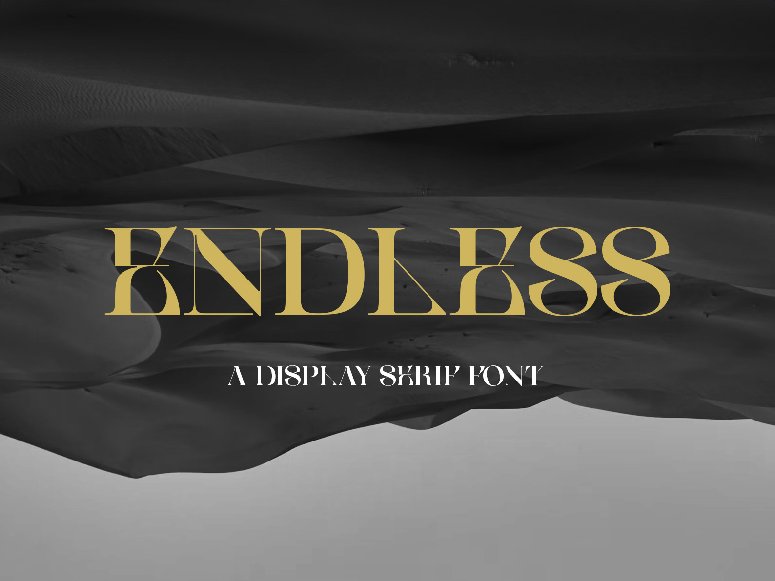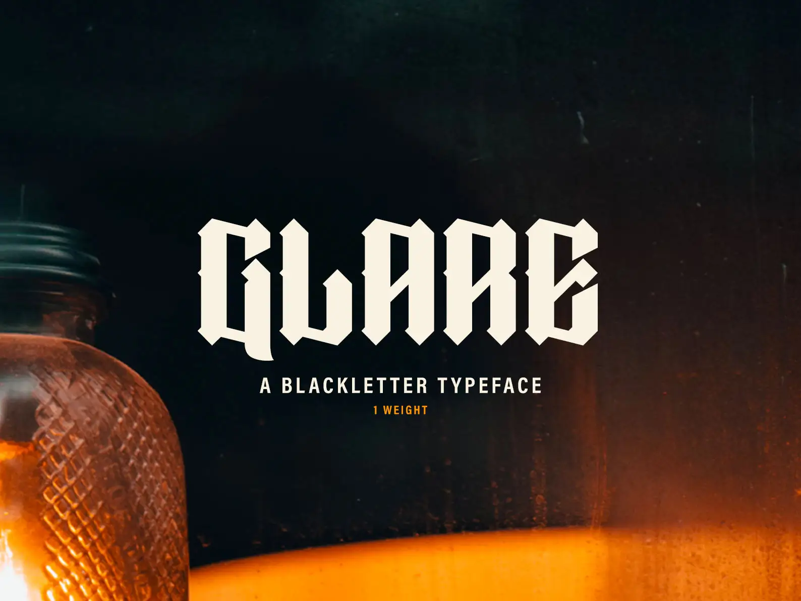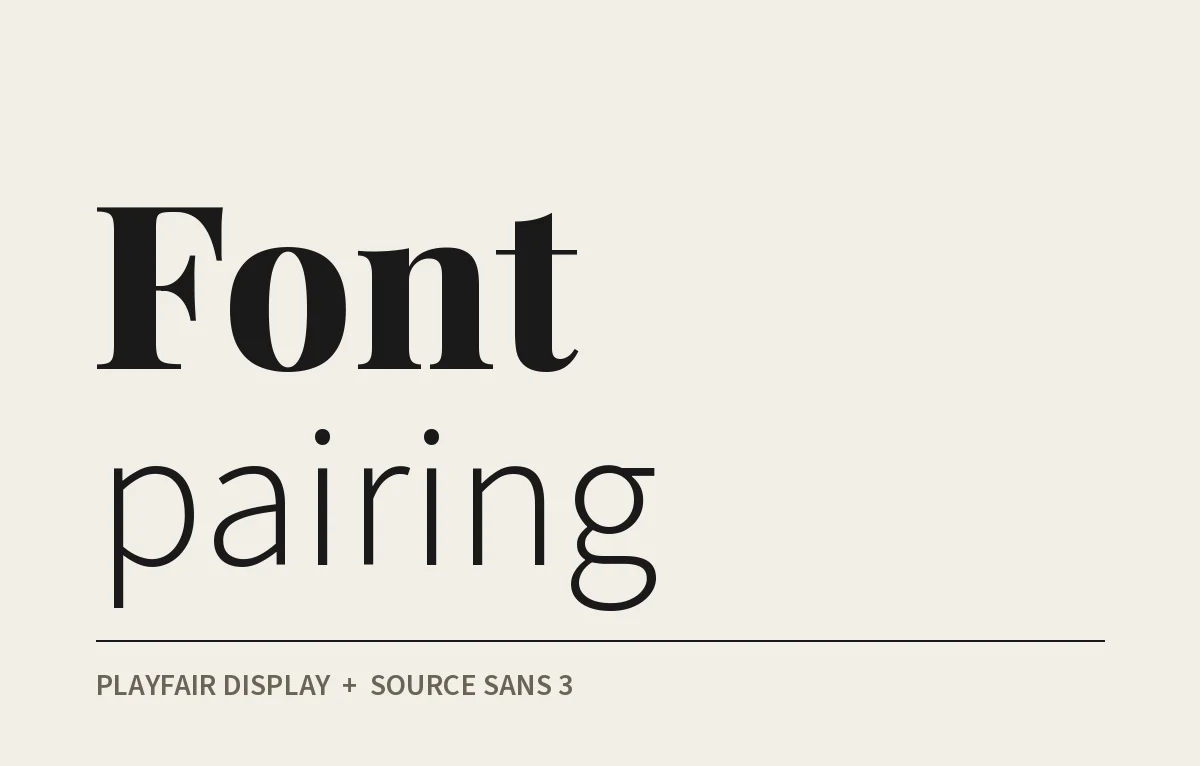
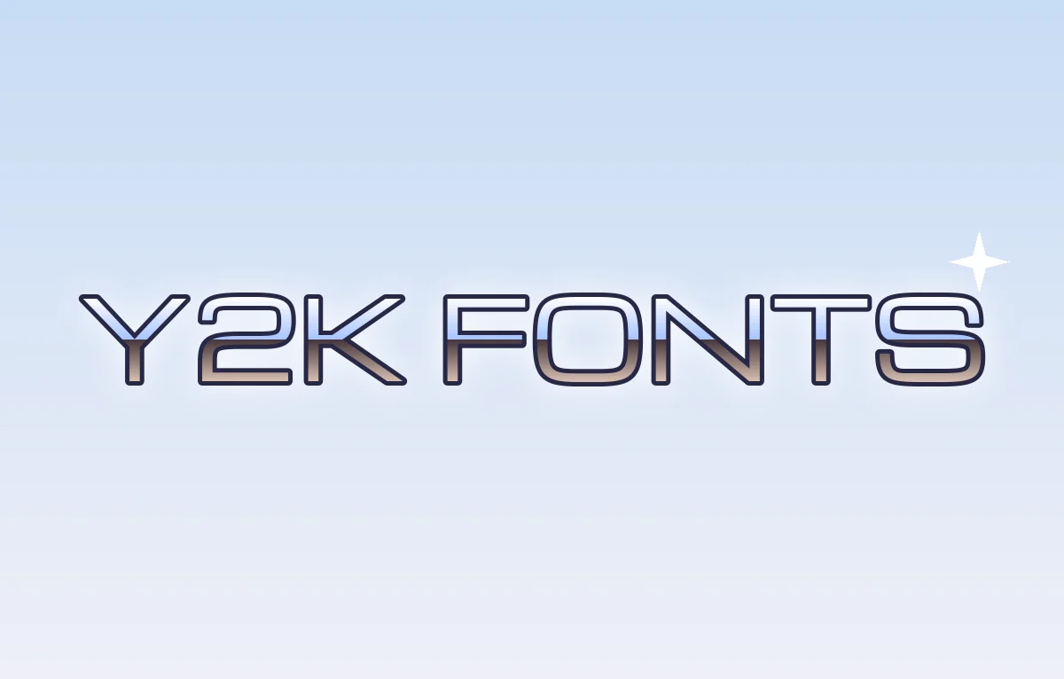
Y2K fonts are back, along with low-rise jeans and tiny sunglasses. Most of what gets sold under that name only gets the era half right though, usually some chrome slapped on a font that would have looked just as at home in 2015.
So this is my list of the fonts that really carry the look, free and paid, and the surface effects that matter just as much as the letters. I've split them by style because "Y2K" covers more ground than people think.
What people mean when they say Y2K
It roughly covers the years from 1997 to 2004. The millennium bug was in the news, Apple was selling the iMac G3 in see-through coloured plastic, and every pop video seemed to be set on a silver spaceship. Windows XP arrived in 2001 with its green hills and glossy blue buttons. Everything was shiny and a bit naive about where technology was taking us.
The type followed that mood. It was either very techy, wide and square like the dashboard of a sci-fi ship, or very soft, round and inflated like a bubble. Both came from the same optimism about the future.
Three looks that all get called Y2K
The first is the futurist look. Think extended sans serifs with squared-off curves, often all caps and spaced right out. This is the one you'd see on trainers, energy drinks and racing games.
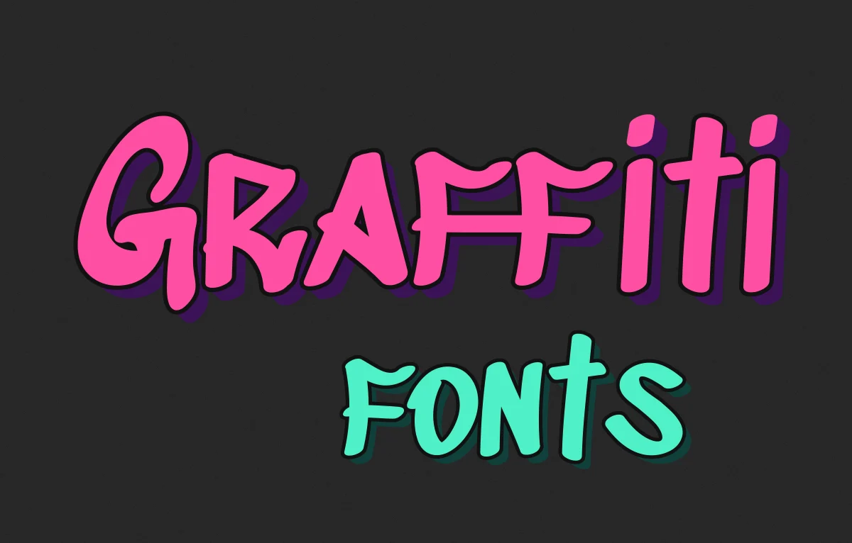
The second is bubble and blob. These are fat, rounded letters that look like they've been inflated, usually covered in chrome or a glossy gradient, sometimes with a little star sparkle next to them. This is the girly, pop side of Y2K and it's the version that's most popular right now. Bubble letters started out on walls and trains, and I get into that in my post on graffiti fonts.
Then there's the screen look, pixel fonts and terminal text taken from early websites and phone screens. It's more lo-fi than the other two and it works well when you want the nostalgia to feel a bit knowing.
There's also a darker cyber side with spiky, gothic-ish shapes, which overlaps with what people now call cyberpunk fonts. I'll come back to that.
Free Y2K fonts I'd start with
These are all on Google Fonts, which means they come with an open licence and you can use them commercially. Still check, because licences on other free font sites are a lot less clear.
Michroma is the one I'd download first. It has that wide, squared-off feel of the classic sci-fi faces, so it gets you very close to the expensive originals for nothing.
Orbitron is more geometric and more obviously futuristic. It's good for headlines and logos. It gets clunky in long lines of text, so keep it short.
Audiowide sits somewhere between techno and sporty. It feels like the title screen of a racing game.
Unbounded is a newer font, but it nails the very wide, inflated look that a lot of current Y2K design is chasing. Use the heavier weights and it gets properly blobby.
Silkscreen is a tiny pixel font that was all over early 2000s websites, and it still looks right for small labels and buttons. VT323 does a similar job if you want something closer to an old terminal screen.
The paid classics behind the look
If you want the real thing rather than something inspired by it, these are the faces that actually shaped the era.
Eurostile is the big one. Aldo Novarese designed it in 1962, building on Microgramma, an all caps face he'd made with Alessandro Butti in the 50s. Eurostile added the lowercase. Forty years later it was on loads of the tech products in the shops, and it still says "the future, as imagined in 2000" better than almost anything else.
OCR-A was made in the late 60s to be read by machines, not people. Designers at the turn of the millennium loved it for exactly that reason, and you'll find it all over flyers and CD covers from the time.
For the darker side, have a look at Mason by Jonathan Barnbrook, released by Emigre in the early 90s. It has those spiky, almost gothic shapes that fed into the cyber look of the later 90s. Our own 5uper sits in a similar space. It's built on a modular grid with sharp edges and circular strokes, and it gets quite aggressive in a way that suits that side of Y2K.
Chrome, glass and the other half of the look
The font is only HALF of it. Y2K type is really about the surface, and a plain Michroma in flat black just looks like a tech company. Put chrome on it and it's 2001.
The classic chrome look is a gradient with a hard line through the middle. The top half goes from white to pale blue like a sky, the bottom half from dark brown or grey up to something lighter like a reflection of the ground. Add a thin white highlight along the top edges and a dark outline round the whole thing. That's most of the metallic text effect done. If you'd rather not build it by hand, our chrome text effect does it in Photoshop in a couple of clicks.
Glass is the other big one, that see-through, slightly frosted look from the iMac and the glossy buttons of the time. A soft inner glow, a white highlight curving across the top third and a bit of transparency gets you close. Our free glass effect is a good shortcut for that.
And for the pixel look, don't fake it with a blur. Set the pixel font at exactly the size it was drawn for, or a clean multiple of it, otherwise the edges go soft and it just looks broken.
Keep it from looking like fancy dress
The quickest way to ruin Y2K type is to use EVERY trick at once. Chrome, pixel text, bubble letters, sparkles and a lens flare on the same poster just looks like a costume.
Pick one of the three looks and stick to it. Then let the rest of the design be fairly modern, with decent spacing and a clean layout, so the Y2K bit reads as a choice and not an accident. For body text i'd use a plain sans. Verdana is a nice touch if you want to be period correct, Matthew Carter drew it for Microsoft in the mid 90s and it was on every screen of the era.
Where Y2K type works and where it doesn't
It works for music, fashion, beauty and club nights, and for any brand talking to people under 30 who are into the aesthetic. It's also great for anything that's meant to be a bit of fun, which is why it suits merch so well. My post on free fun fonts has a few more for that kind of job.
It works much less well for anything that needs to be trusted for years. Trends like this come round about every 20 years and then go away again, so i wouldn't put it on a logo you want to keep. Use it for a campaign, a drop or a single release, and enjoy it while it's in.
Start with one object from the era
When I'm working on something like this I find one real object from the time, like a CD case, a flip phone or an old game, and work from that. It keeps the design honest, and it stops you making a vague mood board version of the year 2000 that nobody actually lived through.