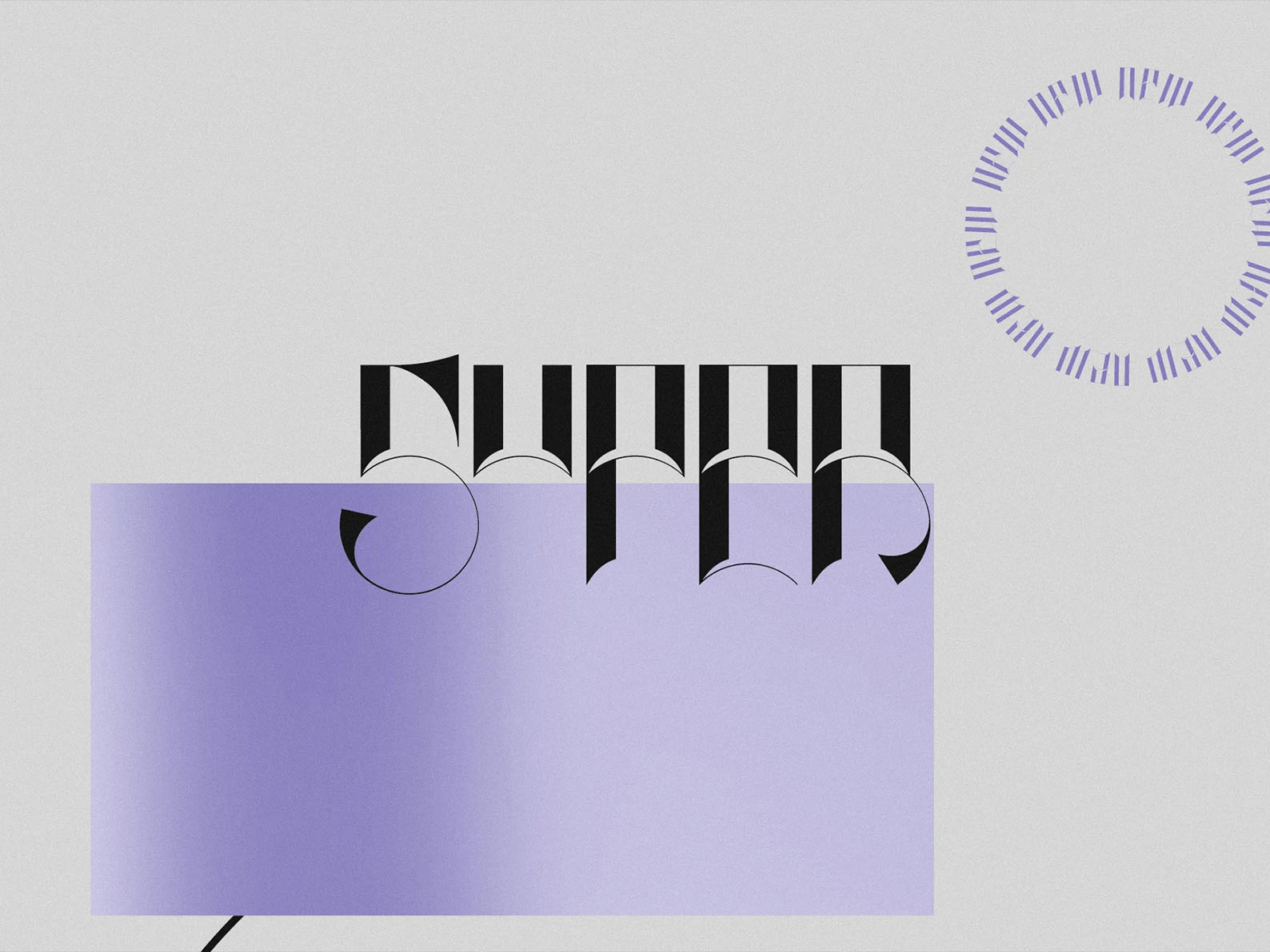
Tracking is the uniform adjustment of spacing applied evenly across all the letters in a word, line or block of text. It's also called letter-spacing. Open the tracking up and your text feels airy and elegant; tighten it down and it feels bold and compact. Unlike kerning — which nudges one pair of letters at a time — tracking is a single global setting that shapes the overall texture and "air" of your type.
I've spent 15 years designing and selecting type for brands, including custom lettering for Nike and Vans, and tracking is one of those small details that quietly separates polished work from amateur work. Below you'll find clear visual examples, the difference between tracking, kerning and leading, and exactly how to adjust it in Photoshop, Illustrator and on the web.
Tracking Examples: See It In Action
The fastest way to understand tracking is to see the same word set three ways. The letters and font are identical — only the spacing between them changes.
Notice how the tight version feels punchy and assertive — good for a logo or a bold headline — while the loose version feels calm, premium and spacious, the kind of treatment you see on luxury packaging and editorial covers. Neither is "correct"; each sends a different signal. That's the whole point of tracking: it's a tone control.
Tracking vs Kerning vs Leading
These three terms get mixed up constantly. They're all about spacing, but they control completely different things. Here's the quick version:
| Term | What it controls | Scope | Think of it as |
|---|---|---|---|
| Tracking | Horizontal space between letters | A whole word, line or block — applied evenly | The overall texture and "air" |
| Kerning | Horizontal space between letters | One specific pair at a time (e.g. A↔V) | Fixing individual awkward gaps |
| Leading | Vertical space between lines | The gaps between rows of text | How tightly lines stack |
So if a single pair of letters looks awkwardly close or far apart, that's a kerning fix. If the entire word or paragraph feels too cramped or too loose, that's tracking. And if your lines of text feel like they're crowding each other vertically, that's leading. Kerning is a micro-adjustment; tracking is the macro setting that governs the whole feel.
Kerning fixes the gap between two letters. Tracking sets the mood of the whole word. Get tracking right and the rest of your type instantly looks more considered.
Why Tracking Matters
Tracking has an outsized effect on both legibility and feeling. Too little and text feels cramped and hard to read; too much and it falls apart into disconnected letters. Spacing is one of several small details that make or break a layout - widows and orphans are another worth watching. Used deliberately, it does three jobs: it improves readability (a touch more space helps small text breathe), it creates visual hierarchy (headings and body can be tracked differently so they read as distinct layers), and it sets the tone — tight tracking reads bold and serious, generous tracking reads airy and elegant.
When To Adjust Tracking
Tracking isn't a set-and-forget setting. The situations where it earns its keep:
- Headings and titles — large type often benefits from slightly tighter tracking so it reads as one solid unit rather than spaced-out letters.
- Body text — keep it neutral, or add a hair of space at small sizes to aid readability. Avoid heavy tracking on long passages; it slows reading down.
- All-caps and small caps — capitals almost always need extra tracking, since they were designed to sit inside lowercase, not next to each other.
- Logos and branding — this is where tracking is fine-tuned obsessively, because a logo is read thousands of times and small spacing decisions compound.
Different typefaces also start from different defaults. Serif fonts often sit comfortably with a touch more tracking, sans-serifs tend to work well at neutral, and display fonts sometimes use extreme tracking as part of their personality. Always start by judging the font at its default before reaching for the slider.
How To Adjust Tracking (Photoshop, Illustrator, InDesign & CSS)
The control is in roughly the same place in every tool — here's where to find it and what the numbers mean:
- Photoshop, Illustrator & InDesign — open the Character panel and look for the tracking field (the icon shows letters with arrows: VA with a double-arrow underneath). Values are measured in 1/1000 of an em.
0is the font default, positive numbers add space, negative numbers tighten. Try ±10 to ±50 for subtle work; headlines might go to −50, spaced caps to +200 or more. - CSS / web — the property is
letter-spacing, best set inemunits so it scales with font size, e.g.letter-spacing: 0.05em;for airy caps or-0.02emto tighten a big headline. - Figma — select your text and use the Letter spacing field in the text properties, set in pixels or percent.
- Canva, Word & Google Docs — look for "Letter spacing" or "Character spacing" in the text or font settings; the same logic applies even if the units differ.
Whatever the tool, work in small increments. Tracking changes are deceptively powerful — moving 5 or 10 units at a time and trusting your eye beats punching in a big number and hoping.
Practical Tips
- Start at the default. Most quality fonts are spaced well out of the box. Judge it before you change it.
- Track headlines tighter, captions looser. Big type can close up; small type needs room.
- Add space to all-caps. A little positive tracking makes capitals far more legible.
- Trust your eye over the number. The right value is the one that looks balanced, not a "correct" figure.
Frequently Asked Questions
What is tracking in typography?
Tracking is the uniform adjustment of spacing applied evenly across all the letters in a word, line or block of text. It's also known as letter-spacing. Increase it to open the text out, decrease it to tighten the text up.
What's the difference between tracking and kerning?
Tracking adjusts spacing evenly across an entire word or block of text. Kerning adjusts the space between two specific letters at a time. Tracking sets the overall texture; kerning fixes individual awkward pairs like "AV" or "To".
What's the difference between tracking and leading?
Tracking controls horizontal space between letters. Leading controls the vertical space between lines. They're separate settings, though both affect how dense a block of text feels.
What is tracking in Photoshop?
In Photoshop, Illustrator and InDesign, tracking lives in the Character panel and is measured in units of 1/1000 of an em. 0 is the font default, positive values add space, negative values tighten. The web equivalent is the CSS letter-spacing property.
Conclusion
Mastering tracking is one of the quickest ways to make your type look intentional rather than accidental. Once you can feel the difference between tight, neutral and loose spacing — and you know which one fits the job — you've got a powerful tone control at your fingertips. Start at the default, adjust in small steps, and trust your eye. If you'd like to put it into practice, our signature typefaces like CS Noire are a lovely place to experiment with spacing, and our guide on how to install a font will get you set up.