
A breve is the small, rounded curve that sits on top of a letter, like the one on ă or ğ. It looks a bit like a tiny smile, and it changes how the letter is said.
It's one of the marks I spend more time on than you'd think when I'm drawing a typeface. It's simple to look at but easy to get wrong, and it gets confused with another accent all the time. That includes on this very blog, which I'll come back to.
The short answer
The breve (˘) is a diacritic, a mark added to a letter to change its sound. In most languages that use it, it tells you a vowel is short or reduced. It's always curved like a bowl, open at the top.
Where the name comes from
Breve comes from the Latin brevis, meaning short. It's the opposite of the macron, the flat line in ā, which marks a long vowel.
You've probably seen both in a dictionary. Older pronunciation guides use them to show how a word is said, with ă for a short a and ā for a long one. Students of Latin poetry use them too, marking short and long syllables to work out the rhythm of a line. That's called scansion and it's where the mark has been used the longest.
And if you play music, you'll know a breve as something else entirely. In British terms it's a note twice as long as a semibreve, which is a bit funny for a word that means short.
The languages that use it every day
Romanian uses the breve on ă. It's a short, neutral vowel, close to the sound at the end of the English word "sofa". You'll find it all over the language, including at the end of everyday words like casă, meaning house. Romanian also uses the circumflex on â and î, so a single Romanian paragraph puts a font's accents through quite a test.
Turkish puts it on the g, giving ğ, which is called yumuşak ge or soft g. It barely has a sound of its own. Mostly it lengthens the vowel before it, so dağ (mountain) is said with a long a. If you've ever wondered why the g in Erdoğan seems to disappear, that's why.
Vietnamese uses it on ă, the short a. Vietnamese is tonal, so ă can also carry a tone mark on top, giving letters like ắ and ặ. That's two marks stacked on one letter, and it's where a lot of fonts fall over.
It turns up in a few other places too. Esperanto has ŭ, as in aŭ, meaning or. Belarusian has ў, the short u, and Russian has й, which Russians call the short i. Some romanisation systems for Korean also use it, writing vowels as ŏ and ŭ.
A breve is not a caron
This is the one people mix up, and i'll be honest, an earlier version of this post did too. It said Czech and Slovak use the breve on letters like ď and ť. They don't. That mark is a caron, also called a háček.
The difference is the shape. A breve is ROUND, like a u. A caron is pointed, like a small v, and you'll see it on č, š, ž and ř. On a few letters with tall stems, like ď, ť and ľ, the caron gets squashed into something that looks like an apostrophe, which doesn't help anyone tell them apart.
So if the mark is curved, it's a breve. If it comes to a point, it's a caron. There's also an upside down breve, the inverted breve (ȃ), which turns up in some dictionaries and in phonetic notation, but you're unlikely to need it outside of those.
How the breve gets drawn
When I draw a breve for a typeface it starts as a simple bowl, but it has to match the rest of the font. In a serif typeface with thick and thin strokes, the breve usually gets the same contrast, heavier at the bottom of the curve and thinner at the tips. In a geometric sans it might be a near perfect half circle with even weight.
The tricky part is height. On lowercase letters the breve sits above the x-height with a small gap, and that gap has to feel the same as the gap under every other accent in the font. On capitals there's less room before the line above, so most fonts use a flatter, shallower version for Ă and Ğ. If a font uses the same tall breve on capitals as on lowercase, lines of text can start to collide.
Cyrillic adds another wrinkle. The breve on й and ў is traditionally drawn with a bit more character, often with heavier ends, and a Latin breve dropped onto a Cyrillic letter can look slightly off to a native reader. Good fonts that support both scripts carry a separate version for each.
None of this is something you'd ever notice when it's done right, and that's the point. A good font is meant to disappear into the reading, which I talk about more in my post on what a font is.
Check your font before you need it
Plenty of fonts don't include a breve at all, especially free display fonts. If you type ă in one of those, your computer swaps in the letter from a different font, and you get a mismatched character sitting in the middle of your headline.
So test before you commit. i keep a short line of text for this: Ăă Ğğ Ŭŭ Ắắ Йй. Paste it into whatever you're designing in and look at every letter. If any of them change style, the font doesn't cover them. On Google Fonts, look for the Latin Extended subset, and for Cyrillic if you need й or ў.
If you're building something on the web, it's worth knowing the breve exists in Unicode two ways. There's a combining breve (U+0306) that attaches to the letter before it, and most common letters also come ready made, like ă and ğ. Fonts usually handle the ready made ones better, so use those where you can.
This matters most for anything with real names on it. Getting someone's name wrong because the font swapped a letter is a small thing that people NEVER forget.
The rest of the accent family
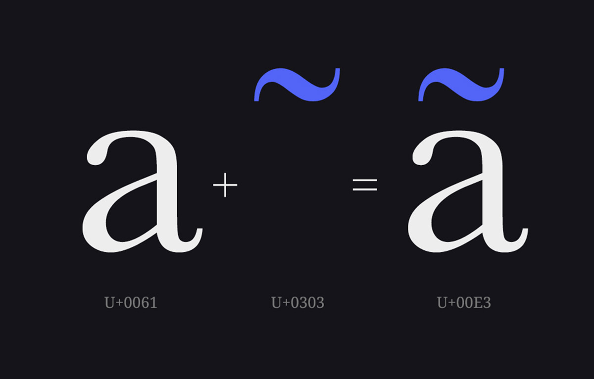
The breve is one of a whole set of small marks, and if you're designing for more than one language you'll meet most of them. The tilde and the circumflex sit on top like the breve does. The ogonek hangs underneath.
And then there's the cedilla, which this studio is named after. Romanian is a good place to end, because it uses the breve and also gets caught up in a cedilla mix-up of its own. Its ș and ț should have a small comma underneath, but old fonts and keyboards often swapped in a cedilla instead. Once you start noticing these things you'll see them everywhere.