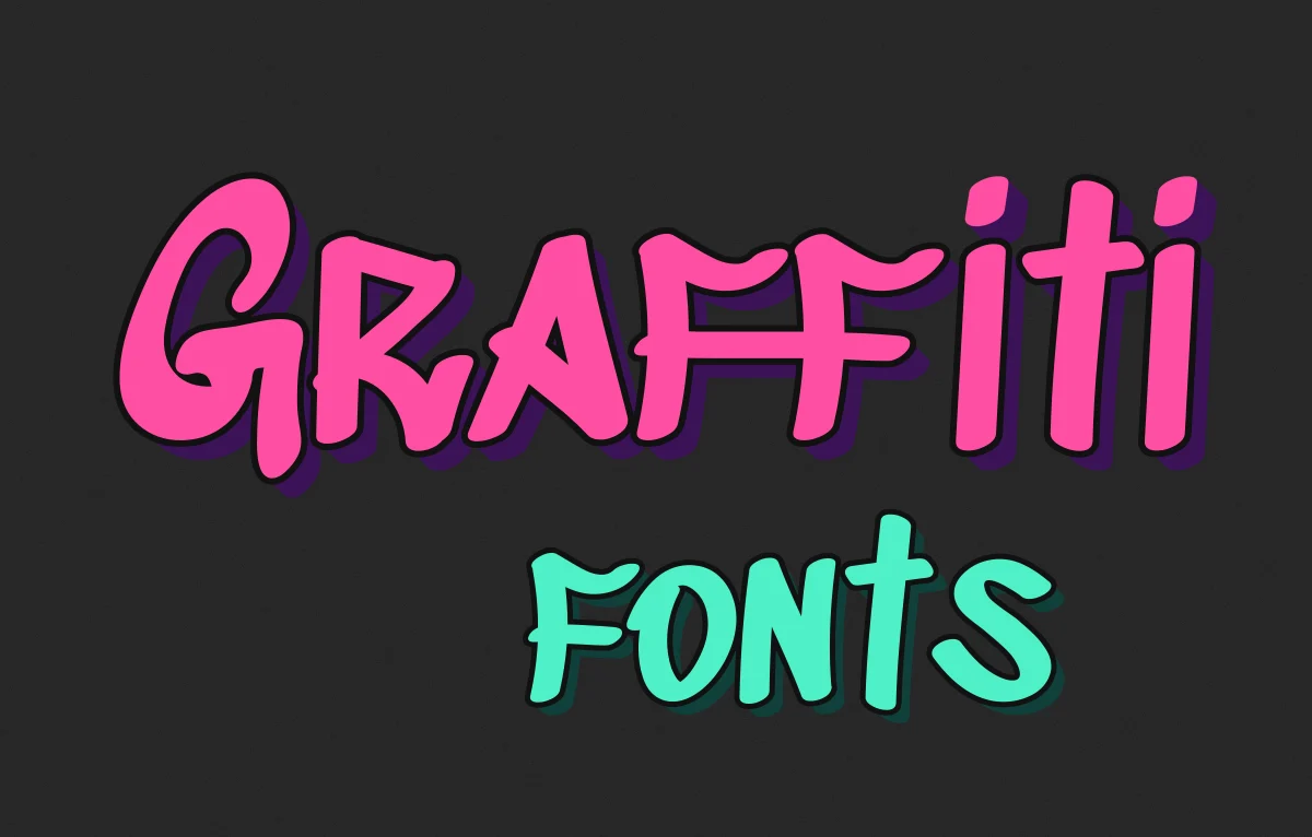
Most graffiti fonts look like someone described graffiti to a computer. The letters are there and the drips are there, but the energy isn't.
I've spent 15 years in type and lettering, including bespoke work for brands like Vans where street culture is a big part of the look, so i notice this stuff more than I probably should. This post is my shortlist of graffiti fonts that hold up, what each one is good for and how to push them further. They're all free. And for some jobs the honest answer is that no font will do, so I'll cover that too.
Why most graffiti fonts look fake
Real graffiti is written by hand, at speed, with a can that's slowly running out. Every letter comes out a little different from the last one. The writer bends the A because of what the R next to it is doing.
A font can't do that on its own. It has one version of each letter and it puts that same letter down every time you type it. So a word like "letters" gets two identical t's and two identical e's sitting side by side, and your eye picks up the repeat straight away even if you couldn't say why. That's where the clip art feeling comes from.
Better fonts get round it with alternates. They carry two or three versions of the common letters and swap between them as you type, using an OpenType feature called contextual alternates. If a graffiti font doesn't have them I'd think twice about it.
A very short history of writing on walls
People have scratched their names into walls for as long as there have been walls. But the graffiti most of us picture, big painted letters on trains, starts in Philadelphia and New York in the late 1960s and early 70s.
In Philly a kid who called himself Cornbread started writing his name all over the city. In New York a teenager who signed himself TAKI 183 got written up in the New York Times in 1971, and after that everyone wanted their name up. Writers moved from small tags on walls to whole pieces on subway cars, and the letters got bigger and harder to read as people competed for space and respect. Bubble letters are usually credited to a writer called Phase 2. Wildstyle came out of the same years, that tangled style with arrows and interlocking shapes that's almost impossible to read unless you're part of the scene.
I bring this up because it matters when you're picking a font. Graffiti isn't one style, it's a whole set of them and each one says something different.
Pick the style before you pick the font
These are the main ones I'd think about:
- Tags are quick signatures done in one go with a marker or a can. They tend to be thin and loopy.
- Throw-ups are bubble letters, usually a fill and an outline in two colours, painted quickly.
- Blockbusters are big square letters made to be read from across the street.
- Wildstyle is the interlocking, spiky stuff. It's mostly made for other writers.
- Stencils are letters sprayed through a cut-out template, clean and a bit political.
For most brand work, throw-ups and tags are what people mean when they ask for "graffiti". Wildstyle looks great but nobody can read the name of your café in it. If the job is a poster or a T-shirt, bubble letters are the safe bet. If it's packaging that needs a bit of edge, a tag-style font used quite small can be enough.
The free graffiti fonts I'd actually download
All of these are on Google Fonts, so they come with an open licence that lets you use them commercially. That isn't true of loads of the graffiti fonts on free download sites, so ALWAYS read the licence before you put one on something you're selling.
Sedgwick Ave Display is the one I'd start with. It's named after the street in the Bronx where hip hop is said to have been born, and it's based on real hand-style lettering. It has a proper marker feel without going cartoonish. There's a lighter version, just called Sedgwick Ave, which works for smaller lines of text.
Permanent Marker has been around for years and you've definitely seen it. It feels more like a quick tag with a chisel-tip marker than a full piece. It's good for notes and scribbles on a poster but it's overused, so I wouldn't build a brand on it.
Rubik Spray Paint takes the rounded Rubik letters and puts a soft sprayed texture over them. The shapes are clean so it reads well, and the texture does the street bit for you. It's handy on websites, where you can't easily fake texture with images.
Rubik Wet Paint is the same idea with drips. Use it carefully. Drips are the fastest way to make something look like a Halloween party flyer.
Knewave is a chunky brush font. It's not strictly graffiti but it has that fast, loose energy and it looks great big on merch.
If you need something steadier to sit under any of these, Bungee is a good shout. It was designed around the vertical signs you see on city streets, so it has the right attitude without pretending to be sprayed. For more loud display faces, my posts on gangster fonts and free fun fonts have a few more that sit in the same world, and my guide to bold display fonts covers the heavier end.
Sometimes a font isn't the answer
If the graffiti lettering is going to be the logo, I would NEVER use a font for it. A logo has to belong to the brand, and if anyone can download the same letters it doesn't. Custom lettering nearly always starts as pencil on paper for me, then gets redrawn, then cleaned up on screen. The rough sketch usually ends up closer to the final than people expect.
And if you can't draw it, hire a writer. Loads of graffiti artists take commissions, and paying someone from the scene is better than faking their work.
How to make digital type look sprayed
A font on its own is flat, it's the extras that make it look like it's on a wall. These are the things I add, roughly in this order.
Start with an outline. Nearly every throw-up has a thick outline in a contrasting colour, and often a thinner second outline outside that. In Illustrator you can stack strokes in the Appearance panel. In Photoshop or Canva a stroke and a hard drop shadow gets you most of the way.
Then give it depth with a 3D block. Copy the word, nudge it down and to the right, fill it with a darker shade and put it behind. That's the classic graffiti 3D text effect. Keep the angle the same across every letter because it falls apart quickly if you don't.
Texture goes on last. A bit of grain or overspray on top of the fill, set to multiply, takes the digital shine off. Sometimes you do want shine though. Plenty of throw-ups are done in silver paint, which writers call chrome, and our chrome text effect gets you that metallic look quickly.
Last of all, pull the letters together until they touch or overlap a bit. Real pieces are packed tight and default spacing makes them look like they're queuing for a bus.
Where graffiti type goes wrong
Body text is the obvious one. Nobody can read a paragraph of graffiti lettering, so keep it to headlines and a few words at most.
The other one is tone, and it's harder to spot. Graffiti grew out of kids in poor neighbourhoods taking up space nobody gave them. When a bank or a property developer puts a spray-paint font on an advert to look edgy, people see straight through it. I'm not saying keep it out of commercial work, that ship sailed decades ago. But the brand should have some real link to the culture, or at least some respect for it, otherwise it just looks like dressing up.
Also watch out for "personal use only" fonts. Free font sites are full of them and they get put on T-shirts all the time. If you've spotted a graffiti font out in the wild and want to track it down, I wrote about finding a font from an image.
Go and look at some real walls
Before you open a font menu, look at actual graffiti. Take photos on the way to work, look up old photos of painted subway cars, notice what the letters really do. Then pick the font that's closest to what you saw and push it the rest of the way by hand. i think that's the only way it ever ends up looking right.