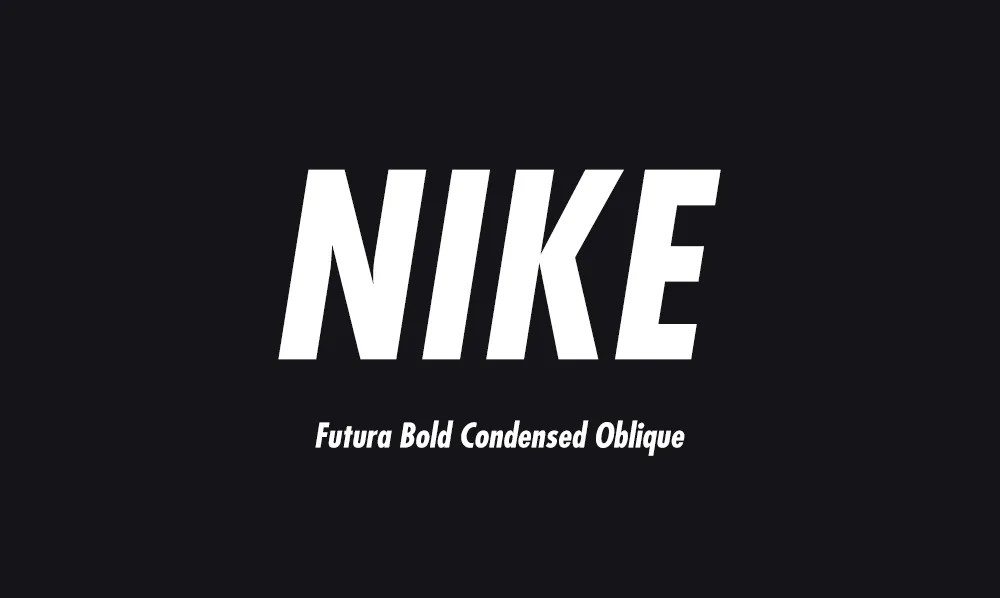
The Nike logo font is a customised version of Futura Bold Condensed Oblique — a geometric sans-serif first designed by Paul Renner in 1927. Nike didn't use Futura straight off the shelf; the brand reshaped it into a bespoke, condensed, slightly slanted cut known internally as Futura ND Nike 365. That tailored treatment is what gives the Nike wordmark its compact, fast, unmistakably confident feel.
I've spent 15 years designing and selecting type for brands, including bespoke custom typography for Nike and Vans, so this is a wordmark I know intimately. Below I'll break down exactly what the Nike font is, the story of how it came to be, whether you can download it (the short answer is no), and the closest free and paid alternatives if you want that geometric, athletic look in your own work.
What Font Is the Nike Logo?
The "NIKE" wordmark sits in a heavily customised cut of Futura Bold Condensed Oblique, set in uppercase with a subtle oblique (forward lean) and tight letter-spacing. The proportions have been narrowed and the weight beefed up so the four letters lock together as one solid, energetic shape rather than four separate characters. Tight spacing is doing a lot of the work here — if you're curious why, our guide to tracking in typography explains how spacing changes the whole feel of a word.
It's worth being precise about terminology: Futura is the typeface, and Nike's specific bespoke weight is a custom font within that family. If that distinction is fuzzy, our explainer on font vs typeface clears it up in a minute.
About Futura — The Typeface Behind the Swoosh
Futura was designed by German type designer Paul Renner in 1927, as part of the modernist New Frankfurt project. It was radical for its time: instead of the traditional serif letterforms everyone knew, Renner built his letters from clean geometric shapes — near-perfect circles, triangles and straight lines. Nearly a century on, that geometry still reads as modern, which is a large part of why it has aged so gracefully on Nike's products.
A few qualities made Futura a natural fit for a global athletic brand. It's highly legible at any size, from a tiny care label inside a shoe to a stadium-sized billboard. It carries no cultural baggage — it feels forward-looking rather than tied to any one era. And its circular, diagonal construction quietly echoes the geometry of the Swoosh, so the mark and the word feel like they belong together. Futura is a favourite for branding generally; you'll spot it in the work behind plenty of famous typography logos.
The History of the Nike Logo & Its Font
The story starts in 1971. The now-iconic Swoosh was drawn by a graphic design student, Carolyn Davidson, for a reported $35. The earliest Nike wordmark paired that mark with a softer, more flowing letterform, but as the company grew it moved toward something more structured and assertive — eventually settling on the modified Futura Bold Condensed that became its signature.
The font's biggest cultural moment came in 1988, when the "Just Do It" campaign launched set in Futura Condensed Extra Bold. That heavy, no-nonsense weight matched the motivational tone perfectly and cemented Futura as Nike's typographic voice. By the mid-1990s Nike was confident enough to drop the wordmark from much of its marketing and let the Swoosh stand alone — but Futura still appears across packaging, product and campaigns whenever words are needed. It's a textbook case of evolution without revolution, the same discipline behind most of the entries in our roundup of the best logo fonts.
Nike didn't invent a font — it took a 1927 typeface and tuned it until the word "NIKE" moved as fast as the Swoosh beside it.
Can You Download the Nike Font?
No — and it's worth being clear about why. The exact Nike wordmark font is a custom, trademark-protected typeface. It isn't sold on any marketplace and isn't licensed to the public, so there's no legitimate way to download "the Nike font" itself. Anything you find online labelled as such is an unofficial recreation built by the community — fine for personal mock-ups and learning, but never appropriate for real client work or anything that could imply you're Nike.
The good news: you don't need the exact file to capture the feel. The look comes from a geometric, condensed, bold sans-serif handled well — and there are excellent fonts that get you most of the way there, including free ones.
Free & Paid Nike Font Alternatives
If you want that clean, athletic, geometric character without crossing any legal lines, these are the typefaces I'd reach for. Several pair beautifully with a strong logo mark.
| Font | Cost | Why it works |
|---|---|---|
| Futura Bold Condensed Oblique | Paid | The closest legitimate match — same family Nike adapted |
| Jost | Free (Google Fonts) | A faithful open-source Futura alternative; great starting point |
| Century Gothic | Often pre-installed | Rounder geometric sans with a similar circular feel |
| Trade Gothic | Paid | Nike's own secondary face for body and UI text |
| Poppins / Montserrat | Free (Google Fonts) | Geometric, versatile, and easy to set in a tight bold |
For more open-source options you can use commercially without a licence fee, see our pick of the best Google Fonts for logo design.
How To Get the Nike Logo Look
Recreating the feel (not the exact mark) comes down to a handful of deliberate choices:
- Start with a geometric sans-serif — Futura, Jost or similar. The circular letterforms are the foundation.
- Go bold and condensed. Pick a heavy weight and a narrow width so the letters read as one confident block.
- Set it in uppercase. The Nike wordmark is all-caps; it reads as a unit rather than a word.
- Tighten the tracking. A touch of negative letter-spacing locks the characters together — small moves only.
- Add a slight oblique. A gentle forward lean injects the sense of movement and speed.
- Pair it with a strong mark. The wordmark and Swoosh share a geometry — your type and symbol should feel related, not just placed side by side.
Frequently Asked Questions
What font is the Nike logo?
The Nike wordmark uses a customised version of Futura Bold Condensed Oblique, a geometric sans-serif designed by Paul Renner in 1927. Nike's bespoke cut is sometimes referred to internally as Futura ND Nike 365, set in a bold, condensed, slightly oblique weight. The exact font is proprietary and not available to buy.
Is the Nike font really Futura?
Yes — the Nike logotype is based on Futura. Nike adapted Futura Bold Condensed Oblique rather than using it off the shelf, adjusting the proportions, spacing and slant to suit the brand. Futura is the closest and most widely referenced match to the wordmark.
Can I download the Nike font for free?
No. The exact Nike font is a custom, trademark-protected typeface that isn't sold or licensed to the public. Any file labelled "Nike font" online is an unofficial recreation. For a similar look, use Futura Bold Condensed Oblique, or free geometric sans-serifs such as Jost on Google Fonts.
What font is used for "Just Do It"?
Nike's "Just Do It" slogan, launched in 1988, was set in Futura Condensed Extra Bold (also described as Extra Black). It uses the same Futura family as the wordmark, in a heavier weight for impact.
Conclusion
The Nike logo font is proof that great branding rarely needs a brand-new typeface — it needs the right one, tuned with care. A 1927 geometric sans, narrowed, bolded and leaned forward, became one of the most recognisable wordmarks on earth. You can't license the exact font, but you can absolutely borrow the principles: geometric base, bold condensed weight, all-caps, tight tracking and a strong companion mark. If you'd like to experiment with that bold, confident energy in your own designs, our signature typeface CS Defiant is a great place to start, and our guide on how to install a font will get you set up.