Typography plays a crucial role in logo design, serving as a visual representation of a brand's identity. From sleek and modern to classic and timeless, typography can convey various messages and evoke different emotions. Let's delve into some famous examples of typography-driven logo designs that have left a lasting impression on audiences worldwide.

fig.1: The eight famous typography logos covered below, from Coca-Cola to Kia.
Coca-Cola
The Coca-Cola logo is a prime example of timeless typography design. Created in 1886, its flowing script font, known as Spencerian script, exudes elegance and friendliness. This iconic logo has undergone subtle refinements over the years but has retained its essence, symbolizing the brand's heritage and global appeal.
Kellogg's
Kellogg's iconic logo features bold, uppercase lettering with a classic serif font. The typography is instantly recognizable and evokes a sense of tradition and nostalgia, reflecting Kellogg's long-standing history as a beloved breakfast brand. The vibrant red color adds warmth and energy to the logo, symbolizing the brand's dedication to nourishing families and promoting wholesome living through its range of cereals and snacks.
Zara
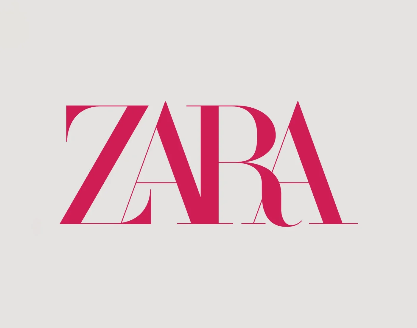
Zara's logo is a testament to simplicity and sophistication. Featuring a clean, minimalist font, the logo emphasizes the brand's commitment to modernity and elegance. The sleek typography allows the brand name to stand out prominently, reinforcing Zara's status as a global fashion icon known for its chic and contemporary designs.
Canon
Canon's logo is characterized by its bold, uppercase lettering and distinctive red color. The typography exudes strength and reliability, reflecting Canon's reputation as a leader in the imaging and optical products industry. The clean, sans-serif font communicates professionalism and precision, aligning with the brand's commitment to delivering high-quality products and innovative solutions.
NASA
NASA's logo, known as the "meatball," has been an enduring symbol of space exploration since 1959. The typography used in the logo is bold and futuristic, reflecting the agency's pioneering spirit and commitment to scientific advancement. The circular emblem features the letters 'NASA' alongside a stylized depiction of a planet and stars, capturing the essence of exploration and discovery.
Disney
Disney's distinctive logotype, often referred to as "Waltograph," captures the magic and whimsy of the brand. The playful, hand-drawn letters evoke nostalgia and appeal to audiences of all ages.
Absolut
The Absolut wordmark is a good lesson in restraint. It launched with the vodka in 1979, set in heavy, condensed capitals, and it has stayed close to that original ever since. You'll often read that Andy Warhol designed it, but he didn't. The bottle and branding came from a Swedish ad agency, and Warhol's link to the brand came later, in 1985, when he painted the bottle for the first of Absolut's artist adverts. Those ads made the bottle shape so well known that later campaigns could get away with showing little more than its outline. The type works because it does very little and lets the bottle do the talking.
Kia
Kia recently unveiled its new logo in 2021, marking a significant departure from its previous design. The updated logo features a bold, modern font with sleek lines and sharp angles. The letters 'K' and 'I' are connected in a continuous loop, symbolizing Kia's commitment to innovation, connectivity, and progress. This typography-driven logo reflects Kia's ambition to redefine itself as a leader in the automotive industry, embracing the future while honoring its heritage.
Conclusion
In conclusion, these examples demonstrate the immense impact typography can have on a brand's identity. Whether through timeless elegance, modern simplicity, or playful creativity, typography remains a powerful tool for conveying a brand's message and values to its audience. I've done deeper dives on a few on their own, like the Nike logo font, the font Facebook uses and the Stranger Things font.