Want edgier designs? We got you..
What Font Is Used For Memes?
Unpacking Impact, Comic Sans, and the Bold Text Behind Viral Image Text
Ever paused mid-scroll and wondered what font makes that meme pop? From Impact’s bold letters to cheeky Comic Sans, memes typography isn’t accidental. It’s a blend of caption font conventions, text overlay know‑how and internet meme style that keeps them viral.
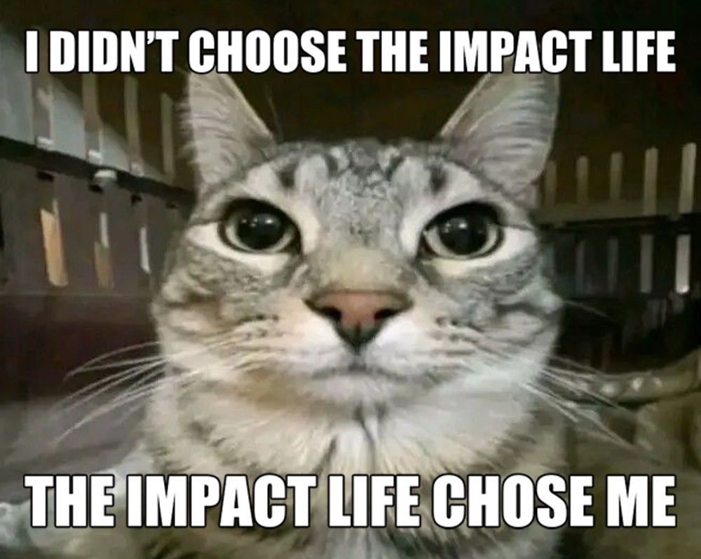
Classic Impact caption next to playful Comic Sans, a tale of two styles.
The Reigning Champion: Impact Font
Impact, created by Geoffrey Lee in 1965, became the de facto caption font for dank memes. Its thick strokes, tight letter spacing and heavy weight mean the white text with a black outline—bold text at its finest—cuts through any background. That unapologetic punch? It’s memes typography 101.
Why Impact? Bold Letters and Readability
The secret behind Impact’s dominance is contrast. The tall x‑height and condensed forms guarantee legibility at small sizes - the same traits that make it a favourite in famous logos too.. Overlay that text on a busy scene and it remains crystal clear. It’s graphic design fonts meeting guerilla marketing: every caption font choice drives shareability.
Comic Sans: The Playful Sidekick
Not just a villain in serious design circles—Comic Sans brings irony to memes. Its casual curves and uneven baseline riff on the child‑like scrawl. When paired with absurd images, Comic Sans amplifies humour, turning simple text overlay into a comedic device.
Text Overlay Techniques
Beyond font selection, style matters. Meme makers use white text with a 2px black stroke. That stroke—also known as outline or drop‑shadow—ensures captions remain legible against any photo. This approach defines internet meme style: a caption font that screams clarity.
Caption Font Alternatives
Modern memes sometimes swap Impact for sturdy system fonts: Arial Black, Anton or Bebas Neue. Graphic design fonts with similar weight keep that viral image text vibe alive. For minimalist memes, Helvetica Bold and Montserrat do the trick—still bold text, just a cleaner silhouette.
Custom and Web‑Safe Options
When platforms strip custom CSS, meme creators fall back to web‑safe families: Impact, Arial, sans‑serif. For social apps, built‑in stickers often embed Impact or bold letters resembling it. The goal? Fast loading, instant caption font consistency.
Evolution of Memes Typography
From early LOLcats scrawled in Comic Sans to today’s slick Impact knock‑offs, memes typography has matured. Tools like Canva and Photoshop give novices access to premium graphic design fonts—blurring the line between casual meme and polished advert.
Impact on Engagement
Studies show bold letters and high‑contrast text boosts share rates. That rapid comprehension—viral image text you can read in a glance—fuels retweets and reshapes pop culture.
Meme Fonts as Digital Vernacular
Fonts carry tone. Impact’s assertive shout, Comic Sans’s playful whisper: they’ve become part of internet dialect. These caption font choices reflect community, inside jokes and evolving trends in graphic design fonts.
Conclusion: More Than Just Typeface
Memes typography is a craft. Impact font and its bold text companions—Comic Sans, Arial Black, even bespoke outlines—transform images into shareable moments. Next time you laugh at a meme, spare a thought for the caption font doing the heavy lifting.