Alright, let's be honest. Picking fonts for a brand — especially something as personal as a coffee shop — can feel overwhelming. You scroll through endless options, everything starts looking the same, and you end up defaulting to something safe. But the letters you choose are doing some heavy lifting. They're setting the stage, whispering (or shouting) about the kind of experience someone's about to have before they even smell the beans. Are you a serious third-wave temple of pour-overs? A cozy, curl-up-with-a-book nook? A buzzing community hub? Your font choice is part of that story.
I've spent 15 years selecting and designing type for brands — including custom lettering for Nike and Vans — and the same principle applies whether you're branding a global skate label or a single café: the right typeface doesn't just decorate a logo, it carries a brand's voice. Below are 10 typefaces with real character, each suited to a specific kind of coffee shop. No generic picks. If you're still shaping your brand's broader visual identity, also have a look at our roundup of logo fonts that actually say something.
Quick Comparison: All 10 Fonts At A Glance
Short on time? Here's the whole list at a glance. Scroll down for the full notes on each.
| Font | Style | Best For | Foundry |
|---|---|---|---|
| Gist Rough | Textured / Letterpress | Rustic, lived-in shops | Yellow Design Studio |
| Breve Slab | Friendly slab serif | Modern neighborhood cafés | DSType |
| Cassannet Plus | Art Deco | Parisian bistros, patisseries | Atipo Foundry |
| Cold Brew Script | Casual script | Specials boards, craft brews | Hustle Supply Co. |
| Thunderhouse | Bold retro display | Diner-style, nostalgic brands | PintassilgoPrints |
| Cervo | Geometric sans | Modern minimalist shops | Typetype |
| Blacker Sans | Premium sans serif | High-end roasteries | Zetafonts |
| Barrio | Playful hand-drawn | Community-led, family cafés | Omnibus-Type |
| Mocha Mattari | Soft rounded serif | Cozy reading-corner cafés | Dharma Type |
| Konga Pro | Bold retro display | Vibrant, vintage-funk brands | Rodrigo Typo |
Gist Rough — That Perfectly Imperfect, Lived-In Feel
You know the feeling of a place that's been loved for years? The wood counter is a bit worn, the mugs don't perfectly match? Gist Rough, from Yellow Design Studio, bottles that feeling. It's textured, almost like it's been letterpress printed a hundred times. The ligatures and detail work make it feel genuinely handcrafted rather than artificially distressed — a distinction that matters more than people realise. Use this if your shop prides itself on warmth, history, and maybe makes a killer rustic apple tart.
What to pair it with: A clean grotesque like Founders Grotesk or Inter for menu body copy. Gist Rough is too much personality for long-form reading.
Breve Slab — Sturdy, But Make It Friendly
Slab serifs can sometimes feel a bit blocky, a bit too serious. Breve Slab (by DSType) sidesteps that beautifully. It has the solid, dependable structure that works for clarity on menus — but the edges are softened, rounded just enough to make it feel approachable, almost cheerful. It suggests quality and tradition without intimidating. Think of it as the reliable friend who also tells good jokes. A solid choice for a shop that balances quality coffee with a welcoming, modern neighborhood vibe.
Cassannet Plus — A Whisper of Old-World Elegance
Channeling a bit of Parisian flair? Cassannet Plus (Atipo Foundry) has Art Deco elegance down pat. It feels refined, sophisticated, maybe even a little glamorous, but never fussy. It evokes those classic bistro signs and old enamel signage. If your space features marble countertops, intricate tile work, or serves delicate pastries alongside meticulously brewed espresso, Cassannet whispers class without straining. Want to lean further into that refined mood? Our piece on elegant fonts covers more typefaces with that quiet drama.
The brands that get this right pick two fonts, occasionally three, and stick with them ruthlessly. Restraint is what separates a coherent identity from a Pinterest mood board.
Cold Brew Script — Like Your Barista's Confident Scrawl
Don't mistake this for a fussy, overly ornate script. Hustle Supply Co.'s Cold Brew feels fluid, energetic, and natural — like someone skilled quickly wrote out the daily specials. It has movement and personality, perfect for conveying immediacy and craft. It shines on feature boards or for highlighting specialty drinks. It says "we care about the details, but we're not stuffy about it." Right for a spot focused on fresh, innovative brews and a dynamic atmosphere.
Designer's note: Scripts like this work best when they have room. Cramped on a tight menu, they lose their charm fast. Reserve them for headers and feature copy.
Thunderhouse — Bold, Unapologetic Retro Punch
Sometimes subtle isn't the goal. Thunderhouse (PintassilgoPrints) is loud, proud, and dripping with vintage cool. It's condensed, impactful, and instantly evokes a specific era — think 1950s diners, old gas station signs, maybe a hint of industrial grit. It's not trying to be subtle; it's making a statement. If your coffee shop has a strong theme, embraces nostalgia, or just wants to grab attention from across the street, Thunderhouse has the muscle. Pair it with photography that earns the volume.
Cervo — The Minimalist With a Secret Smile
At first glance, Cervo (Typetype) looks like a clean, straightforward geometric sans. And it is — highly readable, modern, great for conveying clarity. But look closer. Those small quirks in the terminals, the slight unexpected angles (check out the 'k'). They give it a subtle wink, a hint of personality beneath the minimalist surface. Perfect for the modern café that values clean design but doesn't want to feel cold or sterile. It suggests intelligence and a touch of wit.
Blacker Sans — Quiet Confidence, Premium Feel
There's a certain weight and elegance to Blacker Sans (Zetafonts) that speaks volumes without shouting. It feels grounded, mature, undeniably premium. The slightly wider letterforms give it presence; the subtle curves add sophistication. This isn't about flash; it's inherent quality. If your shop focuses on high-end single-origin beans, curated experiences, and a more discerning clientele, Blacker Sans communicates that refinement effortlessly. This is the kind of typeface I'd specify for a brand willing to invest in a proper visual identity from day one.
Barrio — Pure, Unfiltered Fun
Forget straight lines and perfect kerning for a moment. Barrio (Omnibus-Type) is all about joyful imperfection. It feels like it was drawn with a marker by someone having a really good time. It's bouncy, energetic, and bursting with personality. This is the font for the coffee shop that's the heart of the community, maybe hosts local art, has brightly colored walls, and doesn't take itself too seriously. Pure approachability. If that's the mood you're after, we've got a handful of free fun fonts in a similar spirit.
Mocha Mattari — Like a Steaming Mug on a Rainy Day
Just saying the name feels comforting. Mocha Mattari (Dharma Type) is a gentle, rounded serif that's all about softness and warmth. It's not showy — it's welcoming. It feels familiar, like pulling on a favorite cozy sweater. If your goal is to create a sanctuary where people feel instantly at ease and want to linger, this font radiates that comforting, hug-in-a-mug vibe. Perfect for the quintessential reading-corner café.
Konga Pro — Big, Bold, and Ready to Party
Want something that definitely won't blend in? Konga Pro (Rodrigo Typo) is your answer. Thick, voluptuous, with a playful, almost tropical rhythm. It feels vintage — maybe like an old travel poster — but thoroughly modern in its boldness. A choice that says "we're different, we're vibrant, and we're not afraid to show it." Works brilliantly for brands that embrace bold flavors, bright colors, or just want a totally unique, slightly retro-funk aesthetic.
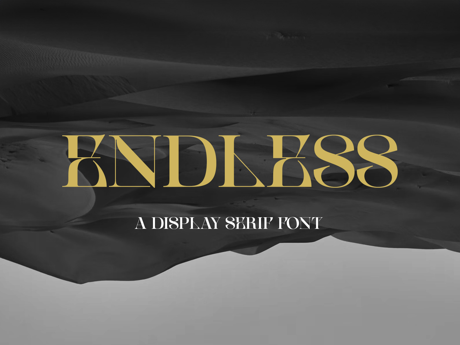
Our Pick: Where a Cedilla Typeface Fits
Full transparency — we make typefaces ourselves, so it'd be weird not to mention where one of ours might fit on this list. If your coffee shop sits in that modern minimalist space (somewhere between Cervo and Blacker Sans on the list above), CS Endless is worth a look. It's a contemporary display serif with subtle character built in — clean enough for a menu, distinctive enough that your signage doesn't look like every other indie café in town. We designed it for exactly this kind of use: brands that want polish without being faceless.
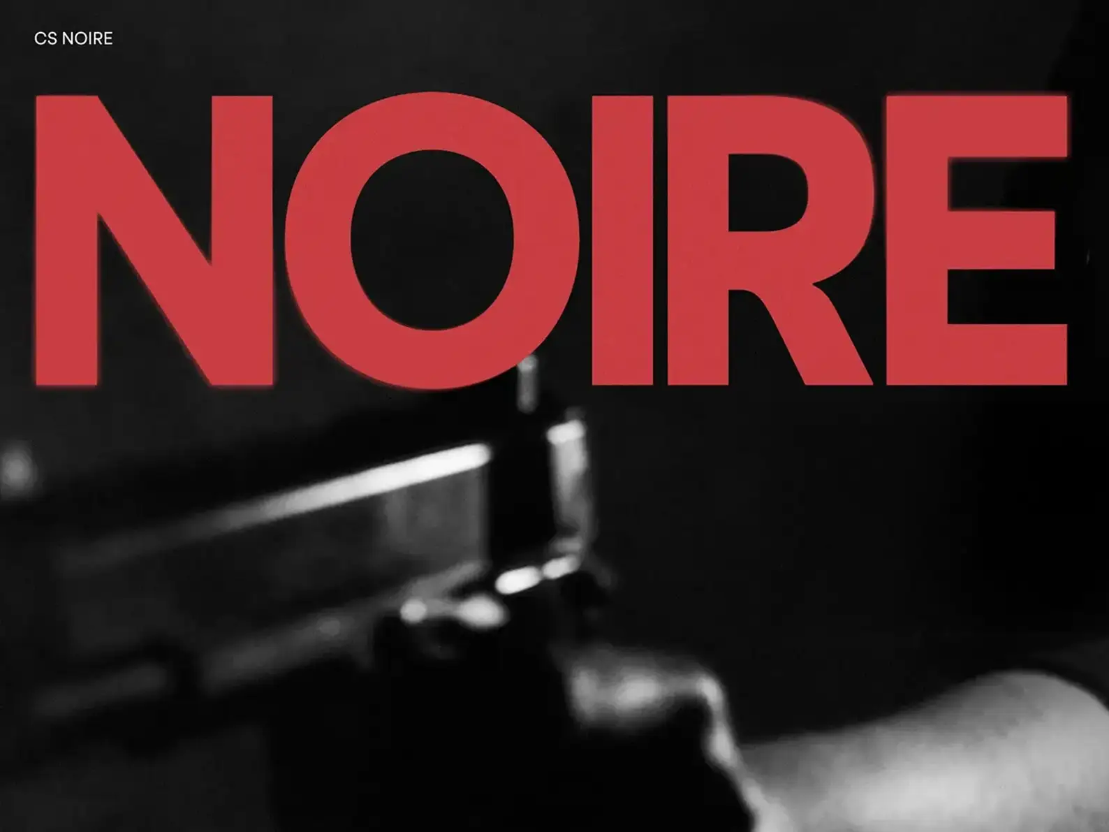
For something with more weight and statement, CS Noire brings the kind of contemporary-but-classical feel that pairs well with marble, brass, and considered third-wave aesthetics.
Thinking Beyond the Font File: Making It Sing
Finding a font you love is just act one. The real work happens when you weave it into your brand's fabric. How does it pair with other fonts? Does that characterful display face need a quiet, readable partner for the small print on your menu? Test drive it everywhere — on mockups of your signage, your website, your loyalty card, even the tiny labels on retail bags. Readability is king, especially for menus, but don't sacrifice personality entirely. It's a balancing act, and the sweet spot is where style meets function.
From experience, the brands that get this right pick two fonts (occasionally three) and stick with them ruthlessly. A display face for your logo and headers, a workhorse sans or serif for body copy, optionally a script for accents. That's it. Watch what brands like Blue Bottle, Stumptown, or your favourite local indie do — restraint is what separates a coherent identity from a Pinterest mood board.
Where To Buy Coffee Shop Fonts (And What To Watch Out For)
Your best bet for premium quality and full families (different weights, italics, language support) are sites like MyFonts, Fontspring, or Creative Market. Often, buying directly from the foundry is the best route — you're supporting the creators directly and you usually get better licensing options. Don't dismiss free resources like Google Fonts or Font Squirrel either; you might find something with similar spirit, especially for body text. But for the typeface that becomes your brand, treat it as an investment, not an expense. A $50 font you use for 10 years is the cheapest design decision you'll ever make.
One trap to avoid: licensing. A "free for personal use" font is not licensed for your café. Read the EULA. Commercial use, distribution (i.e. embedding on a website), and merch use are often separate tiers. Pay for the right licence — it costs less than dealing with a foundry's lawyer.
The Last Drop — It's About Feeling
Choosing a font is less about rules and more about intuition. Which one feels like your coffee shop? Which one captures that specific blend of aroma, taste, sound, and community you're brewing up? Don't just look at the letters — try to feel the atmosphere they create. When you find the one that resonates, that truly speaks your brand's language, you're not just choosing a font. You're giving your coffee shop its voice. Go brew something beautiful.