Here's something that took me far too long to learn: luxury isn't a font. It's a posture. Walk past the windows of Hermès or Dior and the letterforms doing the heavy lifting are often surprisingly plain — Didone serifs, Roman capitals, sometimes nothing more than a well-cut sans. What makes them feel expensive is the restraint. Generous spacing, single typefaces used with conviction, no decorative noise.
That's good news if you're working without a foundry budget. The faces on this list — all free, all licensed for commercial use — can absolutely deliver that high-end feel, provided you set them properly. I've spent 15 years choosing and designing type for brands, including custom lettering for Nike and Vans, and I've used most of these on real client work. Below: 13 free luxury fonts, with notes on where each one actually earns its keep. If you want to go deeper on the look generally, our piece on elegant fonts covers the wider category.
Quick Comparison: All 13 Fonts At A Glance
Short on time? Here's the whole list at a glance. Scroll down for the full notes on each.
| Font | Style | Best For | Source |
|---|---|---|---|
| Playfair Display | High-contrast transitional serif | Editorial headers, blog brands | Google Fonts |
| EB Garamond | Classical old-style serif | Body copy, heritage brands | Google Fonts |
| Cormorant | Display serif, expressive | Wedding stationery, perfume | Google Fonts |
| Bodoni Moda | Modern Didone | Fashion, magazine covers | Google Fonts |
| Oranienbaum | Antiqua-inspired serif | Real estate, jewellery | Google Fonts |
| Cinzel | Roman capitals | Logos, monograms | Google Fonts |
| Italiana | Slender high-contrast serif | Beauty, couture | Google Fonts |
| Cardo | Renaissance serif | Long-form, scholarly brands | Google Fonts |
| Forum | Inscriptional capitals serif | Spas, hotels, signage | Google Fonts |
| Marcellus | Roman-flavoured serif | Restaurants, boutiques | Google Fonts |
| Cormorant Garamond | Refined display Garamond | Quiet luxury, minimal brands | Google Fonts |
| Tenor Sans | Quiet, refined sans serif | Modern minimalist luxury | Google Fonts |
| Della Respira | Engraver's display serif | Invitations, certificates | Google Fonts |
Playfair Display — The One Everybody Knows
Playfair Display (Claus Eggers Sørensen) is the font that taught the internet what high contrast looks like. Sharp hairlines, generous bracketed serifs, a transitional warmth that nods to the 18th-century work of Baskerville and Bodoni. It's beautiful — and absolutely everywhere. That ubiquity is the catch. You've seen it on a thousand wedding invitations and real estate sites, which dulls some of the impact for high-end work. It still sings on editorial layouts and blog brands; just know what you're walking into.
Pair it with: A clean grotesque like Inter or Source Sans for body. Don't double up on serifs.
EB Garamond — Heritage in Every Curve
EB Garamond (Georg Duffner) is a faithful open-source revival of Claude Garamont's 16th-century romans. This is the typeface of book publishing, of considered editorial work, of brands that want to feel like they've been around for a century. Reads beautifully at long lengths — rare for a free font — and the italic is genuinely lovely. If your brand wants gravitas without shouting, this is the workhorse.
Designer's note: Garamond is the secret weapon of a lot of quiet luxury brands. Used at body sizes with generous leading, it reads "old money" without a single flourish.
Cormorant — A Display Serif With Real Personality
Cormorant, by Christian Thalmann at Catharsis Fonts, is what happens when a designer takes the classical Garamond skeleton and pushes everything more extreme — finer hairlines, sharper terminals, more drama. It comes in a dizzying family of variants (Cormorant Garamond, Cormorant Infant, Cormorant Upright, Cormorant SC for small caps) so there's a cut for almost any use case. The standard Cormorant at display sizes is genuinely striking. Use it for wedding stationery, fragrance branding, anywhere a serif needs to perform.
Bodoni Moda — Vogue Energy, For Free
Bodoni Moda (Indestructible Type) is the most underrated free serif on Google Fonts. It's a properly cut Didone — the high-contrast genre that powers every fashion masthead from Vogue to Harper's Bazaar. Razor-thin hairlines, flat unbracketed serifs, a faintly austere geometry. Cropped on a fashion editorial, set as a logo for a beauty brand, paired with high-end photography: this thing genuinely looks like money. It also has a wide weight range and optical sizes, which is rare for free fonts and matters more than it sounds.
Where it shines: Big. The contrast needs scale to breathe. Don't use Bodoni at 12pt — it'll fall apart on screen.
Luxury isn't a font. It's a posture. The faces on this list will absolutely deliver that high-end feel — provided you set them properly.
Oranienbaum — Quiet Authority
Oranienbaum (Oleg Pospelov) draws from early 20th-century Russian Antiqua typefaces. It's slightly condensed, very upright, with the kind of formal poise that suits architectural brands, jewellery, estate agents at the high end of the market. Less theatrical than Bodoni, more contemporary than Garamond — Oranienbaum sits in a quiet middle where a lot of premium brands actually live.
Cinzel — Roman Capitals, Done Properly
Cinzel (Natanael Gama) is modelled on first-century Roman inscriptional capitals — the lettering carved into Trajan's Column. It's an all-caps face (the lowercase is a duplicate of the caps), which sounds limiting until you realise that's exactly what most luxury wordmarks are anyway. Set with wide tracking, Cinzel reads as confident, classical, and serious without feeling stuffy. Excellent for logos, monograms, and the kind of restrained typography that wears well over years.
Pairing tip: Cinzel for the wordmark, Tenor Sans or EB Garamond for everything else.
Italiana — A Slender Whisper
Italiana (Santiago Orozco) is exactly what it sounds like — a slender, high-contrast Italian-style serif with the proportions of couture. Single weight only, which limits its range, but for a logo or a hero headline it's stunning. The thin strokes are almost calligraphic, the wide letterforms feel generous. Beauty brands, perfumeries, anywhere you want to suggest refinement without quite tipping into formality.
Cardo — Scholarly and Underused
Cardo (David J. Perry) was originally designed for classical and medieval scholars — so it has the kind of considered, Renaissance-era proportions that telegraph seriousness and depth. Underused for branding work, which is partly why it still feels fresh. Good for long-form publishing, heritage brands, and anywhere you want to suggest intellectual weight rather than fashion sparkle.
Forum — Built for Stone
Forum (Denis Masharov) is another Roman-capitals serif, but it carries slightly more warmth and personality than Cinzel — looser proportions, friendlier curves. Works beautifully on hotel and spa branding, restaurant signage, anywhere the brand needs to feel rooted and timeless without going full classical. Pairs particularly well with stone, brass, and natural materials.
Marcellus — The Boutique Default
Marcellus (Astigmatic) sits in a similar Roman-flavoured family — flared terminals, slight stroke modulation, a kind of considered formality. I see it constantly on boutique websites, small luxury restaurants, independent jewellers. There's a reason: it's flexible, readable, and unmistakably premium without being ostentatious. A safe default that doesn't read as defaulting.
Cormorant Garamond — Quiet Luxury, Distilled
Cormorant Garamond is the more restrained cut of the Cormorant family — closer to traditional Garamond proportions but with Cormorant's signature finer details. This is the one I'd reach for if a client briefed me on "quiet luxury": stripped-back, generous, confident enough not to need flourishes. Set as a logo with wide tracking, it does about 80% of what a custom commission would, for nothing.
Tenor Sans — The Quiet Sans
Tenor Sans (Denis Masharov again) is the one sans serif on this list, and it earns its place. Slightly flared terminals, narrow proportions, the kind of subtle classical bones that make it feel like a sans drawn by someone who knew their Roman capitals. Quiet, refined, and beautifully suited to modern minimal luxury — think Scandinavian skincare, architectural studios, the kind of brand that doesn't try too hard.
Della Respira — Engraver's Detail
Della Respira (Brian J. Bonislawsky) is modelled on early 20th-century engraver's lettering — the style of formal certificates, monograms, and engraved invitations. It's an all-caps face with delicate detail in the serifs that reads as ceremonial without being heavy-handed. Reserve it for the moments that actually warrant ceremony — invitations, certificates, anniversary wordmarks.
What Fonts Do Luxury Brands Actually Use?
Worth addressing directly, because it comes up constantly. Most heritage luxury brands don't use any of the fonts on this list. They commission their own. Chanel's wordmark, Tiffany's lettering, Cartier, Louis Vuitton, Hermès — all custom-cut typography, often based loosely on existing classical genres but proprietary.
When luxury brands do use commercial faces, you'll see patterns repeat: Didone serifs (Bodoni, Didot) for fashion. Optima and Trajan for cosmetics. Futura and Avenir for the modernist contingent. Garamond and Caslon for editorial. The trick isn't matching what they use — it's matching how they set what they use. Generous spacing. Single typeface, used consistently. No decoration. That's it.
Our Pick: Where a Cedilla Typeface Fits
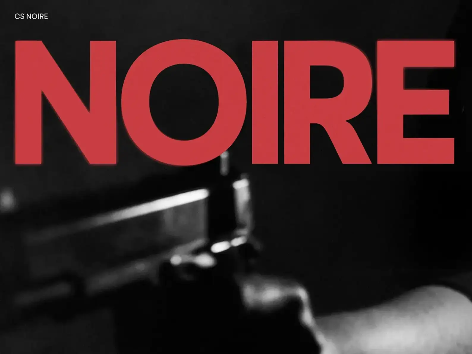
Full disclosure — we make typefaces ourselves, so it'd be strange not to mention where one fits. If you've worked through the free options above and want to step up to something with more distinction (and proper licensing for a commercial brand), CS Noire sits squarely in the contemporary luxury space. It carries Didone bones with a modern, slightly more humanist warmth — closer in spirit to what high-end fashion houses commission than anything you'll find for free.
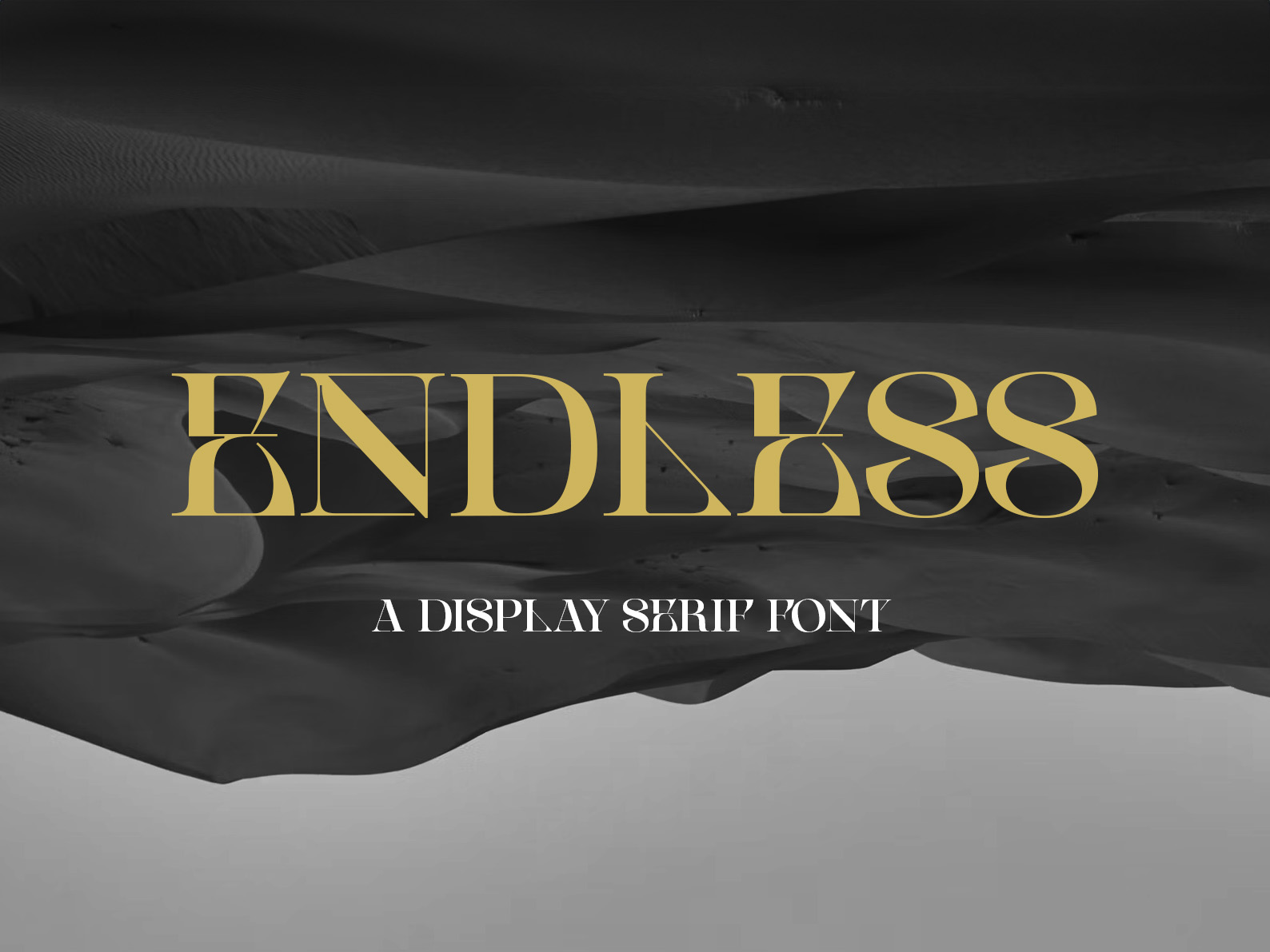
For brands leaning toward the modern-minimal end of luxury (think the Tenor Sans / Cormorant Garamond quiet camp), CS Endless is a contemporary display serif with the kind of subtle character that wears well over years. We designed it to be the bridge between classical and contemporary — restraint with personality.
How To Actually Make a Free Font Look Expensive
A free font set badly will look free. A free font set well can look like a five-figure commission. The settings matter more than the font itself. From experience, four things separate amateur use from professional:
1. Track it out. Default letter spacing is built for body copy. Luxury wordmarks almost always run +50 to +200 tracking. Open up the spacing until the letterforms breathe.
2. Pick one weight and stick to it. The instinct is to use bold for emphasis. Luxury brands use one weight everywhere — usually regular or light — and create hierarchy with size and spacing instead.
3. Stop pairing serifs with serifs. One serif. Then a clean sans for body copy. That's the formula 90% of premium brands follow.
4. Use generous margins. Whitespace reads as expensive. The cheapest design move is cramming things; the easiest luxury upgrade is removing half the content and giving what's left room to exist.
Licensing: The One Trap To Avoid
Every font on this list is covered by the SIL Open Font License (OFL) — free for commercial use, including in logos, on websites, in printed materials, and embedded as webfonts. You can't resell the font itself, but you can use it freely on client work and your own brand. Always download the licence file with the font and keep a copy in your project files.
Where people get caught out: "Free" fonts from sites like DaFont or 1001 Fonts often have "free for personal use only" licences. Using one of those on a paid client logo is technically infringement. If the font isn't on Google Fonts or doesn't ship with an OFL licence file, read the EULA before committing.
The Final Word — Restraint Over Reach
If you take one thing from this piece, let it be this: choosing a luxury font is half the work. The other half is having the discipline to use it sparingly. Pick one face. Set it with care. Resist the urge to add a script accent or a decorative drop cap or a second display serif. The brands that look the most expensive are almost always the ones doing the least.
Any of the 13 above will get you there. Download two or three, mock them up in your actual brand context, and live with them for a few days before deciding. The right one will start to feel inevitable.
Frequently Asked Questions
What fonts do luxury brands actually use?
Most heritage luxury brands use custom-cut typefaces — Chanel, Tiffany & Co., Louis Vuitton and Cartier all commission their own. Where they use commercial faces, expect to see high-contrast Didone serifs (Bodoni, Didot), classical serifs like Garamond and Caslon, and increasingly stripped-back sans serifs like Futura and Optima. The common thread isn't a specific font — it's restraint, generous spacing, and confidence in a single typeface used consistently.
Are these luxury fonts really free for commercial use?
Yes — every font in this list is free for commercial use under the SIL Open Font License (OFL) or a similar permissive licence. That includes logos, websites, packaging, and printed materials. The only thing you generally can't do is resell the font itself. Always check the licence file that ships with the font before using it on paid client work.
What makes a font look expensive?
Three things, mostly. High stroke contrast (the difference between thick and thin strokes — think Bodoni). Restrained, geometric letterforms with no decorative noise. And generous letter spacing — luxury brands almost always set their wordmarks with extra tracking. Honestly, the font matters less than how you set it. A "cheap" font with the right spacing and weight choice will out-class a luxury font crammed at default settings every time.
What's the difference between a quiet luxury font and a maximalist one?
Quiet luxury fonts strip detail back — Tenor Sans, Cormorant Garamond, even a well-set EB Garamond. They rely on proportion and spacing for impact. Maximalist luxury fonts are statement faces with extreme contrast or dramatic flourishes — Bodoni Moda, Italiana, Della Respira. Quiet luxury suits modern minimal brands; maximalist luxury suits fashion, beauty, and editorial.
Can I use Playfair Display for a luxury brand?
You can, but it's been used so heavily since 2014 — across thousands of templates, real estate sites, wedding invitations — that it's lost some of its impact. If you want that high-contrast transitional-serif feel without the saturation, try Bodoni Moda, Italiana, or Cormorant. They cover similar ground with far less template fatigue.