These are the colour trends I'm seeing across graphic design right now, the ones I think will carry into 2027, and a palette with hex codes for each so you can actually use them.
This post started life as a list of trends for 2024. Rather than writing a new one every year and leaving the old ones to rot, I'm keeping this one page and updating it. So if you landed here searching for color trends with the American spelling, you're in the right place too.
Why I don't chase every trend
I'll say this first because it matters more than any palette. Trend colours are great for campaigns, posters, packaging refreshes and social content. They're a BAD idea for a logo you want to keep for ten years.
Every colour trend has a shelf life. Peach Fuzz felt very 2024 by the end of 2024. So use the colours below for things that are meant to feel current, and keep your core brand colours steady underneath.
Pantone went white for 2026
Pantone's Colour of the Year for 2026 is Cloud Dancer, PANTONE 11-4201, an off-white. After Mocha Mousse in 2025 and Peach Fuzz in 2024, a white is a bit of a curveball, and plenty of designers rolled their eyes.
i actually think it's a fair read of where things are. Lots of the work I like at the moment is built on warm off-whites and paper tones instead of pure white, with one strong colour doing the heavy lifting. Cloud Dancer is less a colour to design with and more a background that lets everything else breathe.
Pantone usually announces the next colour in early December, so I'll add 2027's here once it's out.


fig.1: Euphoric Portal Poster from Ra.co • fig.2: Chrome Poster, Guccimaze Zatokyo
Neon noir is still going strong
Neon noir is electric colour on a very dark background. Think violet, cyan and hot pink glowing out of near black, like a city at night in the rain. Neon noir graphic design has been around for a few years and it isn't going anywhere, especially in gaming, music and film posters.
The trick is the background. Pure black (#000000) can look flat and cheap on screen, so I use a very dark, slightly coloured near black instead, like the first swatch above. Then pick one neon to lead and use the others sparingly. Three neons fighting at full strength just looks like a fruit machine.
If you're using it for web or game design, check your text contrast. Neon on dark looks great in a headline but can be hard to read in a paragraph, and the WCAG guideline for body text is a contrast ratio of at least 4.5 to 1.
Chrome and liquid metal
Chrome has come back with the whole Y2K revival. Silvers, cool greys and those reflective gradients that look like liquid metal are everywhere on album covers, fashion campaigns and club flyers.
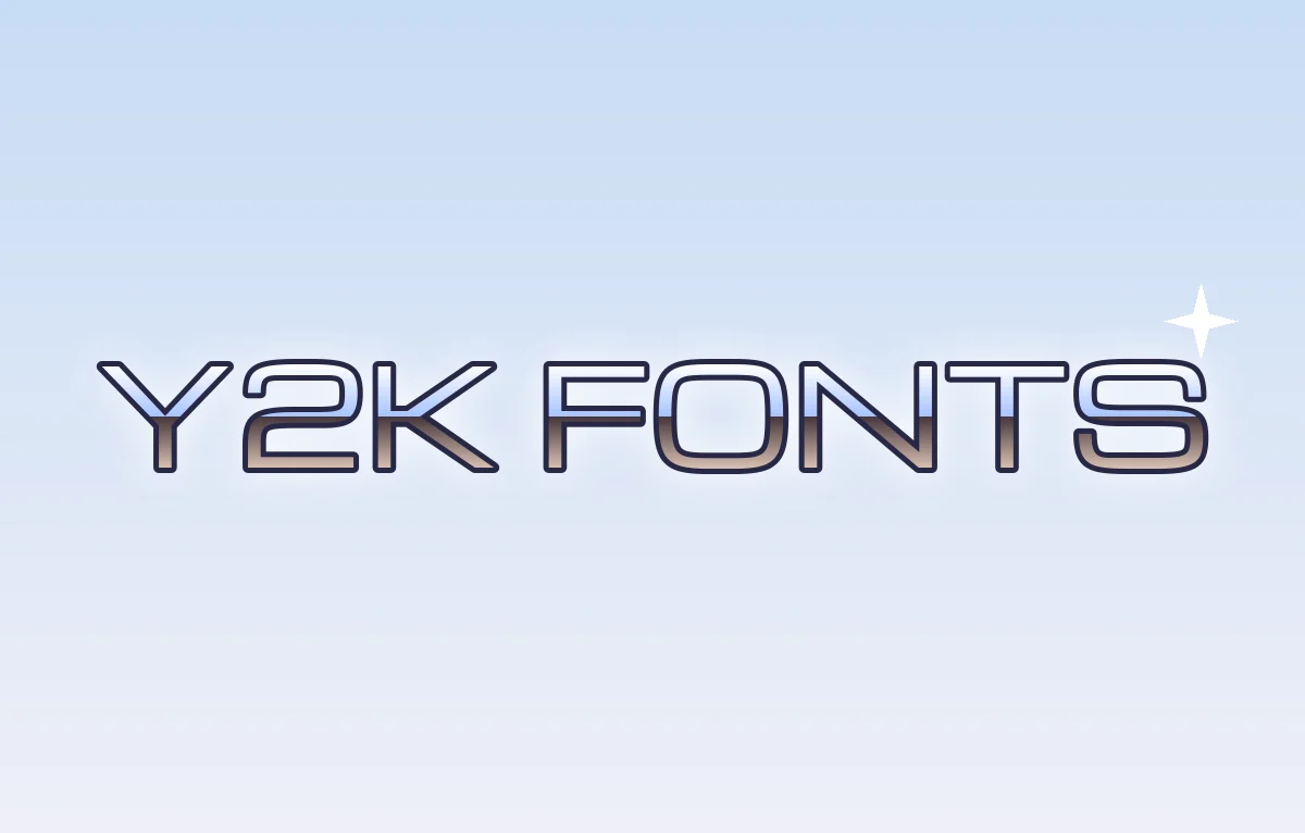
The palette on its own looks a bit dull. Chrome only works when the colours are arranged as a reflection, with a hard horizon line through the middle and a bright highlight on the top edges. That's what our chrome text effect does. And if you want the type to match, I've written about Y2K fonts that suit it.
Acid lime and loud brights
Ever since Charli XCX's brat cover turned a slightly sickly lime green into a whole summer in 2024, acid brights have stuck around. The palette is usually lime, electric orange or a strong blue, set against black or off-white with very little else going on.
What makes this work is how plain everything else is. The type is often a basic sans, sometimes deliberately a bit ugly, and the colour does all the shouting. It suits music, fashion and anything aimed at a younger crowd. It's a hard sell for a law firm.


fig.3: Tokyo Travel Zine Kiosk • fig.4: Props House Plants Branding Stellen
Earthy greens and warm browns
This is the calm end of the list, and the one I'd bet on lasting longest. It's forest and moss greens, oat and clay tones, and the warm browns that Mocha Mousse pushed into the mainstream in 2025.
It's the go-to for food, wellbeing, interiors and anything that wants to feel natural and honest. The risk is that it's so common now that it can look like every other plant shop. Adding one unexpected accent, like a deep red or a bright orange, stops it going beige.
Digital pastels and soft gradients
Pastels haven't gone away, they've just moved on screen. Think soft pinks, periwinkle, mint and butter yellow, often blended into gradients that look a bit like a frosted phone screen.
The danger with pastels is that everything ends up the same lightness, so nothing stands out. Give the design one dark colour for text and key details, a deep navy or charcoal, and the pastels suddenly look deliberate.


fig.5: Madeon Cory Schmitz • fig.6: Mahmud Şahan, New Wife! New Life! AIGA
Colour blocking for when you need to be seen
Colour blocking in graphic design means big, flat areas of strong colour sitting right next to each other, with no gradients and no texture. It's loud and confident and very good at stopping someone scrolling.
The colours above clash on purpose. Keep the shapes simple and let them do the work, and pair it with a heavy typeface so the words can hold their own. My post on bold display fonts has a few that stand up to this much colour. For the wider style it comes from, see my post on maximalist graphic design.
How to use trend colours without dating your work
The simplest way i know is to split the job. Your neutrals, the off-whites, near blacks and greys, do most of the work. Then a trend colour comes in as the accent. A rough guide is 60% neutral, 30% a supporting colour and 10% the trend colour, but don't treat it as a law.
Then check everything in greyscale. If the design falls apart when the colour is gone, the colour is doing a job the layout should be doing. This catches more problems than any palette tool.
Save your palettes as swatches in whatever you design in, with the hex codes written down. It sounds boring but it's the thing that stops a brand drifting a slightly different shade every time someone new touches it.
And if you get stuck, there are tools that'll suggest palettes for you. My post on ChatGPT and graphic design covers using it to explore colour schemes, and there's plenty of colour inspiration in my post on editorial design too.
Pick one and commit to it
If you take one thing from this, don't try to use every trend at once. Pick ONE palette that suits what you're making, push it further than feels comfortable, and keep the rest of the design simple. That's how trend colours end up looking intentional and not like a mood board.