Make your designs unforgettable with our signature fonts
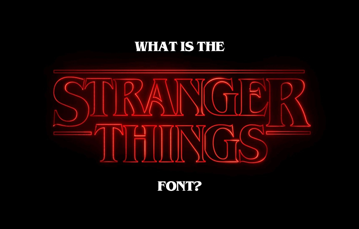
Stranger Things Font
Discover the iconic typography behind Netflix's supernatural thriller
The iconic red lettering of Netflix's "Stranger Things" has become one of the most recognizable logos in modern television. The supernatural thriller series, set in 1980s Hawkins, Indiana, uses a distinctive typeface that perfectly captures the show's nostalgic, horror-tinged atmosphere. But what exactly is the Stranger Things font, and how can you use it in your own design projects?
The distinctive typography of Stranger Things uses ITC Benguiat Bold to create its iconic retro horror aesthetic
What Font is Used in Stranger Things?
The Stranger Things logo uses ITC Benguiat Bold, a serif typeface designed by Ed Benguiat in 1977. This font choice wasn't accidental – the creators specifically selected a typeface from the late 1970s to authentically represent the show's 1980s setting. The slightly condensed, bold letterforms with their distinctive serifs create an instantly recognizable aesthetic that evokes both vintage horror movie posters and classic book covers from the era.
The History Behind ITC Benguiat
ITC Benguiat was created by the legendary typographer Ed Benguiat, who designed over 600 typefaces during his career. Released through the International Typeface Corporation (ITC) in 1977, this font family was inspired by Art Nouveau letterforms and vintage advertising typography. Benguiat drew inspiration from the elegant curves and flourishes popular in early 20th-century design, creating a typeface that feels both classical and slightly mysterious.
Why ITC Benguiat Works Perfectly for Stranger Things
The success of the Stranger Things font choice lies in several key factors. Nostalgic Appeal: ITC Benguiat was widely used during the 1980s, making it instantly recognizable to viewers who lived through that era while feeling authentically retro to younger audiences. Horror Associations: The font's frequent use on horror novel covers and movie posters creates subconscious associations with the supernatural and mysterious. Readable Impact: Despite its decorative elements, ITC Benguiat remains highly legible, ensuring the show's title is easily readable across different media and sizes.
The Cultural Impact of 80s Typography
The font gained popularity throughout the 1980s and was commonly used in book publishing, particularly for horror and fantasy novels. This publishing heritage makes it the perfect choice for Stranger Things, as it subconsciously evokes the Stephen King novels and supernatural paperbacks that inspired the show's creators, the Duffer Brothers. The success of Stranger Things has sparked a revival of interest in 1980s typography and design.
Using the Stranger Things Font in Your Projects
ITC Benguiat works excellently for various design applications. Entertainment Projects: Perfect for movie posters, book covers, gaming logos, and any project requiring a retro horror aesthetic. Branding: Ideal for businesses wanting to evoke nostalgia, mystery, or vintage luxury – think boutique hotels, vintage shops, or entertainment venues. Event Design: Excellent for 1980s-themed parties, Halloween events, or retro gaming tournaments. Digital Design: Works well for websites, social media graphics, and app interfaces targeting millennial and Gen-X audiences.
Where to Get the Official ITC Benguiat Font
The original ITC Benguiat can be purchased from legitimate font foundries including Monotype, MyFonts, Adobe Fonts (included with Creative Cloud subscriptions), and Fonts.com. These sources ensure you're getting the authentic, properly licensed version of the typeface with full commercial usage rights.
Free Alternatives to ITC Benguiat
While the official font requires purchase, several free alternatives capture a similar aesthetic. Benguiat Gothic offers a free version with similar characteristics, while Times New Roman Bold can be surprisingly similar when modified. Various fan-created "Stranger Things Font" versions are available from font websites, though always check licensing terms for commercial use.
Legal Considerations and Licensing
Always ensure you're downloading fonts from reputable sources and check licensing terms for commercial use. Many "free" versions online may not include proper licensing for business projects. When using the font commercially, invest in the official licensed version to avoid legal complications and support the original type designer's work.
Design Tips for Using ITC Benguiat Effectively
Size Matters: ITC Benguiat works best at larger sizes where its distinctive details are visible. Avoid using it for body text or small applications. Color Choices: The iconic red color is strongly associated with Stranger Things, but the font works well in other colors like black, white, or gold for different moods. Spacing: Give the letters room to breathe. The font's bold weight and decorative elements need adequate spacing to maintain readability.
Background and Contrast Considerations
Ensure sufficient contrast between the font and background. The bold weight helps with readability, but poor contrast can diminish impact. When combining with other typefaces, choose clean, simple fonts that won't compete with ITC Benguiat's distinctive character. The goal is to let the font's personality shine while maintaining overall design harmony.
Typography Revival and Modern Usage
The success of Stranger Things demonstrates the powerful connection between typography and cultural memory – the right font choice can instantly transport viewers to a specific time and emotional space. ITC Benguiat has experienced renewed popularity, with designers incorporating it into projects seeking to tap into the nostalgic zeitgeist.
Alternative Fonts with Similar Character
If ITC Benguiat doesn't fit your needs or budget, consider these similar options that capture a comparable aesthetic:
- Copperplate Gothic - Sharp, condensed letterforms with vintage appeal
- Trajan Pro - Classical Roman-inspired capitals with elegant proportions
- Times New Roman Bold - Surprisingly similar base structure when properly styled
- Custom Art Nouveau lettering - Hand-drawn alternatives inspired by the same design movement
Best Practices for Implementation
- Use for headlines and display text rather than body copy
- Maintain generous letter spacing for optimal readability
- Consider the emotional context - works best for dramatic, nostalgic, or mysterious themes
Creating Your Own Stranger Things-Inspired Designs
When creating designs inspired by the Stranger Things aesthetic, remember that the font is just one element. Combine ITC Benguiat with period-appropriate colors (deep reds, dark backgrounds), textural elements that suggest age or mystery, and lighting effects that enhance the supernatural mood. The key is building an atmosphere that feels authentically connected to the 1980s horror and science fiction genres.
Conclusion: The Lasting Impact of Thoughtful Typography
The Stranger Things font – ITC Benguiat Bold – represents more than just a typographic choice; it's a masterclass in how the right font can enhance storytelling and create instant brand recognition. Whether you're creating a horror movie poster, designing a retro-themed website, or developing branding for an entertainment project, understanding the power of this iconic typeface can elevate your design work.
By choosing ITC Benguiat, the Stranger Things creators didn't just select a font – they chose a time machine that transports viewers directly into the show's supernatural 1980s world, proving that sometimes the most effective design choices are hiding in plain sight.