Make your designs unforgettable with our signature fonts
The Best Adobe Fonts for Your Design Projects
10 Premium Typefaces Worth Using in Your Work
Adobe Fonts gives you access to thousands of typefaces through Creative Cloud. But having too many options makes choosing harder. You need fonts that actually work for real projects, not just look good in screenshots. These ten fonts from Adobe's library are ones designers keep coming back to because they solve actual problems. Some are good for headlines, others work better for body text, and a few can handle both without breaking.
Premium fonts from Adobe's collection that designers actually use.
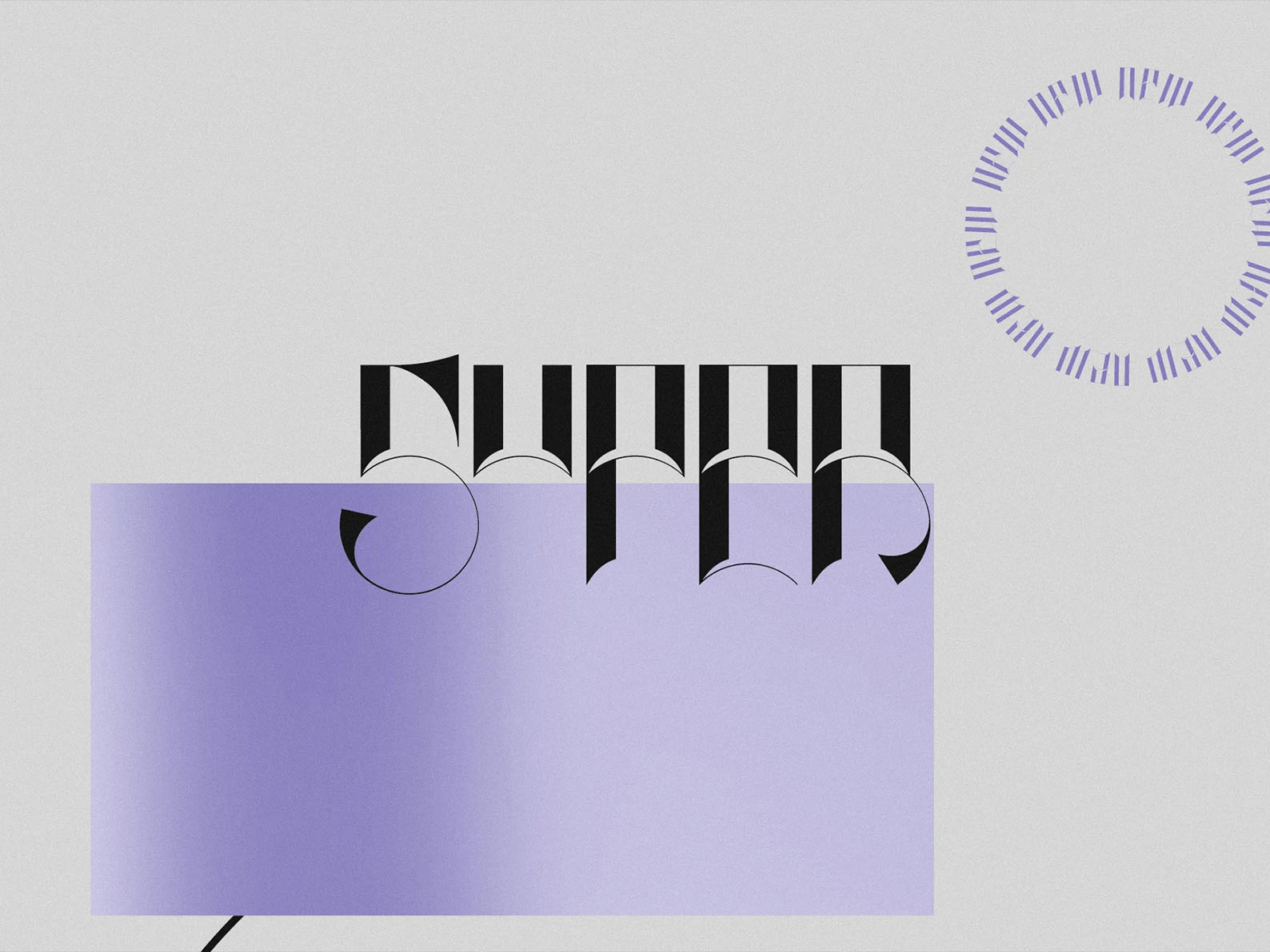
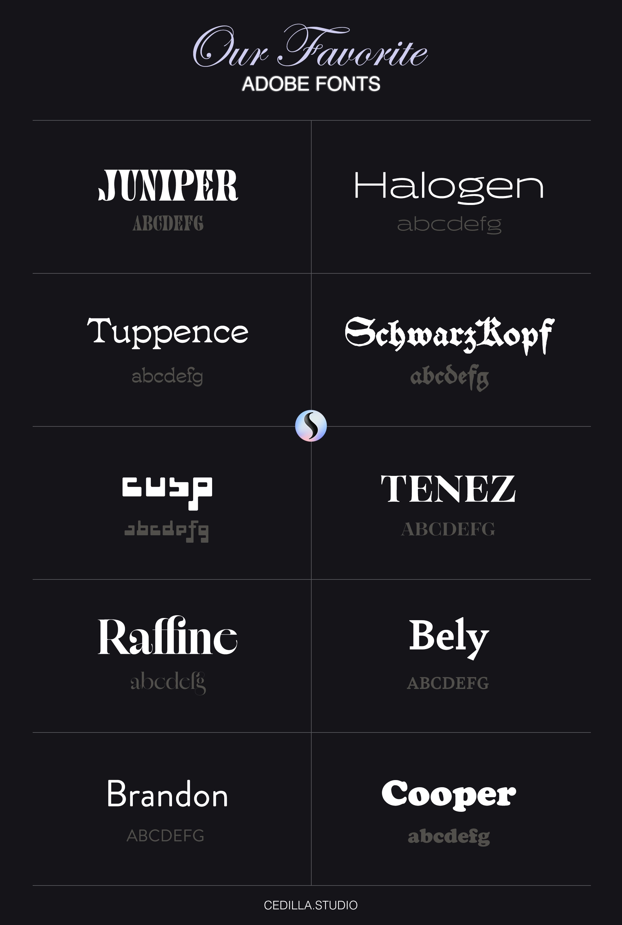
1. Juniper Font
Juniper is bold and condensed which means it takes up less space than regular fonts. The letters are thick and angular so they grab attention fast. You'll see this kind of font on magazine covers and posters where space is tight but impact matters. It works well for logos too if your brand needs to look strong or edgy. Just don't use it for paragraph text because nobody wants to read condensed letters for more than a headline. Fashion brands and sports companies use fonts like this a lot, probably because it feels current without trying too hard.
2. Halogen Font
Halogen is one of those fonts that does everything pretty well. It's a sans serif with clean lines but it's not boring like Arial or Helvetica can be. The family has a bunch of different weights from thin to bold so you can use it for an entire brand system without needing other fonts. That's actually useful when you're building something that needs to look consistent across print and digital. It reads fine at small sizes which matters more than people think. And it doesn't have a strong personality so it won't clash with whatever visual style you're going for.
3. Tuppence Font
Tuppence looks handmade which is the whole point. The baseline isn't perfectly straight and the letters have this organic feel that's hard to get with regular fonts. It's good for brands that want to seem authentic or artisanal, like craft breweries or small batch food companies. But you can't use it everywhere because too much personality gets annoying. Keep it to logos and headlines. The irregular shapes make it memorable which is what you want in a logo font. Just pair it with something simple for everything else or your designs will look messy.
4. Schwarz Kopf Font
This font takes inspiration from old blackletter typography but it's way more readable than actual blackletter. It's got that gothic look without being impossible to read. Beer brands love this style and so do metal bands for obvious reasons. You don't want to use too much of it though. A little goes a long way because the style is so distinct. It works when you need something to feel traditional or established, like you've been around for a hundred years even if you haven't. Just be careful it doesn't look like you're trying too hard to seem authentic.
5. Cusp Font
Cusp is weird in a good way. The letters are geometric and angular, almost like they were designed by an architect. Tech companies use fonts like this when they want to look cutting edge. It's not practical for body text at all but that's fine because nobody expects it to be. Use it for logos or app interfaces where you need something that stands out. The shapes are distinctive enough that people will remember them. But it only works if your brand is actually modern or experimental. Don't use it for a law firm or a bank unless you want to confuse people.
6. Tenez Font
Tenez is a serif that feels formal without being stuffy. The proportions are balanced so it reads well at different sizes. You can use it for both headlines and longer text which makes it more flexible than display-only fonts. It's got that expensive look that luxury brands want, probably because the details are refined but not overdone. Museums and cultural institutions tend to use fonts like this because they need to look credible. And it works in print better than on screens but it's still fine for digital if you size it right.
7. Raffine Font
Raffine has high contrast between thick and thin strokes which gives it drama. Fashion magazines use this kind of font because it looks elegant and sophisticated. The curves are precise and the spacing is tight so it feels expensive. But high contrast fonts can be hard to read at small sizes because the thin parts disappear. Keep it big for headlines and covers where it can show off. It pairs well with simple sans serifs when you need contrast in your typography. Just don't overuse it or everything starts looking like a perfume ad.
8. Bely Font
Bely is a contemporary serif that manages to feel both traditional and modern. The letterforms have personality but they're not distracting. You can use it for editorial layouts because it's readable in paragraphs. The details are there if you look close but they don't get in the way of reading. Professional services and cultural organizations use fonts like this when they need to look trustworthy. It's reliable which sounds boring but that's actually what you want for body text. Save the experimental stuff for headlines.
9. Brandon Font
Brandon is probably one of the most used fonts in Adobe's collection and there's a reason for that. It's a geometric sans serif that works for almost anything. The family is huge so you have tons of weights to choose from. Startups and tech companies use it a lot because it feels current without being trendy. It reads well on screens which matters since most design ends up digital now anyway. And it's not as overused as some other popular fonts so your work won't look like everyone else's. You can build entire brand systems with just this one family.
10. Cooper Font
Cooper has that retro vibe from the 70s but it still feels relevant. The letters are round and friendly which makes it good for food brands or entertainment companies. It's got personality without being childish so it works for adult audiences too. The bold weight is the most useful because that's where the character really shows. Thin versions of Cooper lose some of the charm. Use it when you want something approachable and warm. Just don't pair it with other decorative fonts or you'll end up with too much going on.
Using Adobe Fonts in Your Projects
Adobe Fonts syncs across all your Creative Cloud apps automatically. You don't have to install anything manually which saves time when you're working on multiple projects. When you're picking fonts, think about contrast and how they work together. A good rule is to pair a serif with a sans serif or a decorative font with a simple one. And always check readability at the actual size you'll be using. What looks good at 72pt might be terrible at 12pt.
Final Thoughts
These ten fonts cover most of what you'll need for professional work. Juniper and Cusp are good for when you need impact. Halogen and Brandon are reliable for almost everything. Tuppence and Cooper add personality when you need it. And the serifs like Tenez, Raffine, and Bely give you options for more formal or editorial work. The key is knowing when to use which one. Don't pick a font because it looks cool, pick it because it solves the problem your design has. Good typography isn't about using fancy fonts, it's about making your content easy to read and understand while supporting whatever message you're trying to communicate.